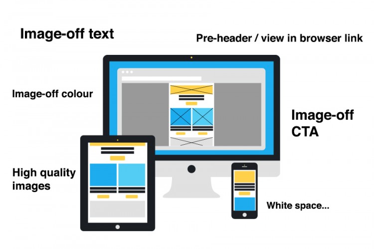
You can usually tell if an email has been well designed as it lands in your inbox. If the designer and coder has done their job well you will immediately be aware of a few things. The email is legible without the use of images. The text content is actual text and not hidden within an image. This is good for a number of reasons but mainly it allows the user to engage with the email immediately. The email will also employ colour in the spaces where images should be. This type of image-off optimisation encourages readers to enable images, see the email in all of its glory and continue reading. If the email is well designed the alt text for images will also received some attention. If images with text on them have to be used then the alt text should match the image text and and be nicely styled.
Lastly before the images are enabled ensure all of the calls to action, buttons and text links are clearly visible without images. Again this allows a reader to easily engage with the email before having to make a decision like “should I enable the images or delete this?”
If the designer and coder have done their job well and the reader decides to enable images (or is using a device that enables images automatically like the iPhone), then other elements of good email design become important. Images in emails should be of high quality, meaning they should look great as well as being optimised to be the smallest file size possible. It is important to plan which images are to be used in an email design. Space is precious in emails so make sure that lifestyle images or those used for a purely aesthetic purpose have real impact and improve the design.
A good use of colour is also important in email design. If you’re going to go the trouble of sending an HTML email you might as well use all the available functionality. Keep things fresh and engaging with colour and use it to draw peoples attention to the all important call to action.
Whilst space in email is precious or at least limited don’t cram your content in and create squished, cramped layouts. Allow content elements to have sufficient padding and space so the content is easy on the eye and easy to understand. Typography especially needs a careful approach when it comes to spacing. Make sure when setting type to adjust the font size and line height accordingly for headers and body text. Make sure that links are properly coloured. Keep the typography interesting and attractive to look at, try to vary character styles and employ bold and italic text if necessary. Make sure to check your work as you go as too much spacing or poorly set type can easily ruin a promising design.
Other important parts to great email design must include the important bits. The pre-header, unsubscribe link, view in browser link, terms and conditions and company address. All these common place pieces of an email need to be designed just as much as any other element. Make sure they fit in with the content but don’t steal the attention. These pieces of content should be visible when needed but otherwise not detract from the main message of the email.
Lastly a great email design is one that has been tested. The designer has used knowledge, feedback and data from previous emails to guide decisions and make informed choices about what should and should not be included.


