The obvious answer is “mainly on a smartphone” and the second answer is “very quickly and often not at all” and this presents a range of challenges. The good news is that, if you get it right, it also presents opportunities.
First impressions have always been important, we all make initial judgments on things we see. What is changing is the sheer number of things presented to us and nowhere is this more prevalent than in the online World.
We have become skilled at filtering and used to receiving and sending information in snippets via social media. The result of this is that we are taking less time to formulate an opinion about what we see online and for marketers, this may mean the difference between a message being read or ignored.
So, what can we do as marketers to give our emails the best chance of being opened and clicked?
The first step is to get the email into the inbox (or at least the Promotions tab in Gmail). Many factors affect email delivery but here we’re looking at user engagement. If you treat your email list right, through relevant content and an appropriate frequency of messages, then they are more likely to engage with your brand and the emails you send them.
Aside from contextual drivers (where you are and what’s going on around you), there are three things which encourage emails to be opened on a mobile device:
Who it’s from – make sure your brand is clearly displayed in the sender field.
Subject line – Should be an attention grabber and short as we see between 33 and 72 characters on a smartphone depending on the device and whether it’s viewed portrait or landscape.
Pre-header – don’t let this say “Can’t see this email? Click here to view online” or worse “Unsubscribe”. You have two subject lines worth of space to add in some attention-grabbing copy.
So after maybe three or so seconds you have the readers attention. They can now see your email – or at least parts of it on Android devices where images usually don’t always display by default, we’ll get to that later!
What people see needs to clear, concise and easy to read. Unless people have a solid affinity with your brand, you’re talking seconds to keep their attention.
This is where thoughtful responsive design can work for you. Scaleable design is all very well but rearranging content so it stacks to a single column is just the start and you should use all the tools at your disposal. Fluid design – where elements of an email change size and shape depending on the device they’re viewed on – is better, but responsive is what gives you the best chance of keeping people reading your email and – more importantly tapping back to your website.
I am still surprised at how many emails I see that employ none of these tactics – they look the same across every device which means images are too small to see and any copy on top of images impossible to read. There is usually too much text that people won’t read even if they could see it and links that are text based, small and too close together for fingers to accurately tap. These companies are missing out on engaging with their subscribers whilst their competitors using responsive design are eating into their market share and sales revenue.
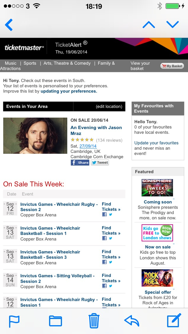
This email from Ticketmaster is a classic case of doing what they’ve always done with no consideration for emails being viewed on smaller screens:


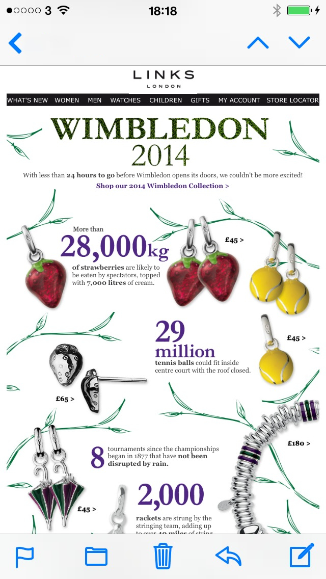
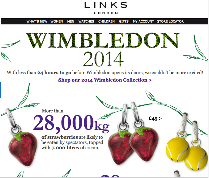
Links of London have a more friendly design but the email is just one big image so everything shrinks down on a ‘phone and is difficult to read. You’ll also see nothing if images are switched off.


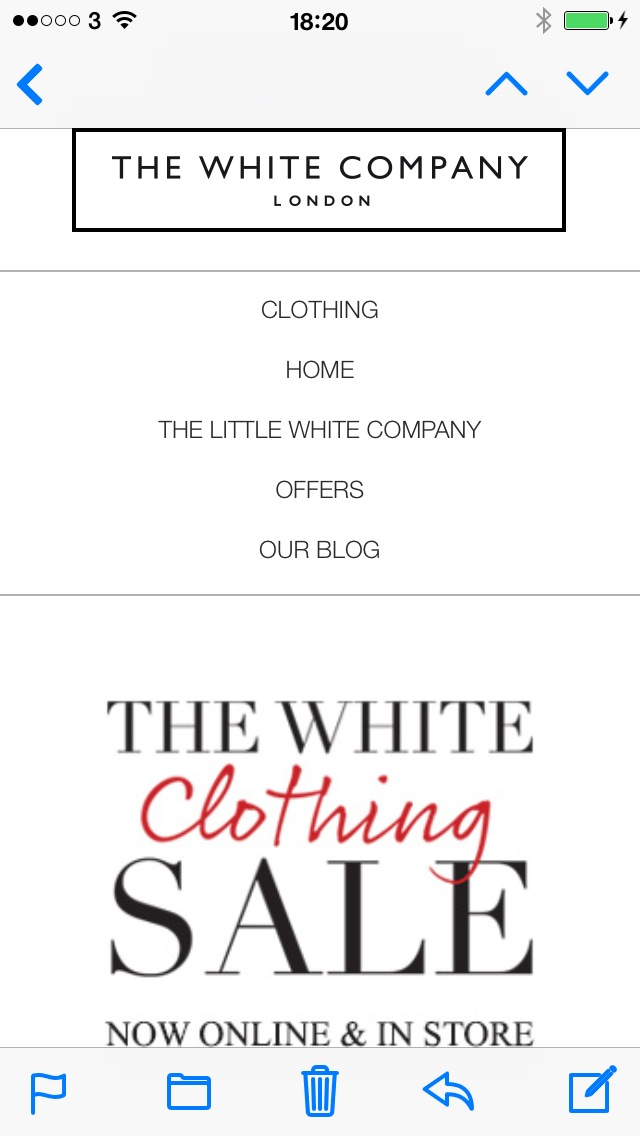
The White Company, however, have an email that looks very different between devices. The navigation is reordered and easy to read and tap. The key message of a sale is clear and the content has been ordered and stacked in such a way as to still engage as you scroll:


Work with a designer who can visualise how your original email design for desktop can best translate to smaller screen sizes. Then make sure you have an ahead-of-the-curve coder who can turn designs into responsive emails that look good on any device and in all the important email clients – Outlook (Hotmail), Gmail, Yahoo, AOL, etc. Decide which elements of your email should be included, summarised, reordered and changed to optimise it for the device and your subscribers.
Give your readers the emails they deserve – if you don’t they will stop reading them and move on.

