
Some of you will have spotted a trial of a grid-style (almost Pinterest-like) visual inbox for the Promotions tab in Gmail.
The Promotions tab (where all marketing emails now generally end up) now displays thumbnails allowing users to see elements of your marketing emails.
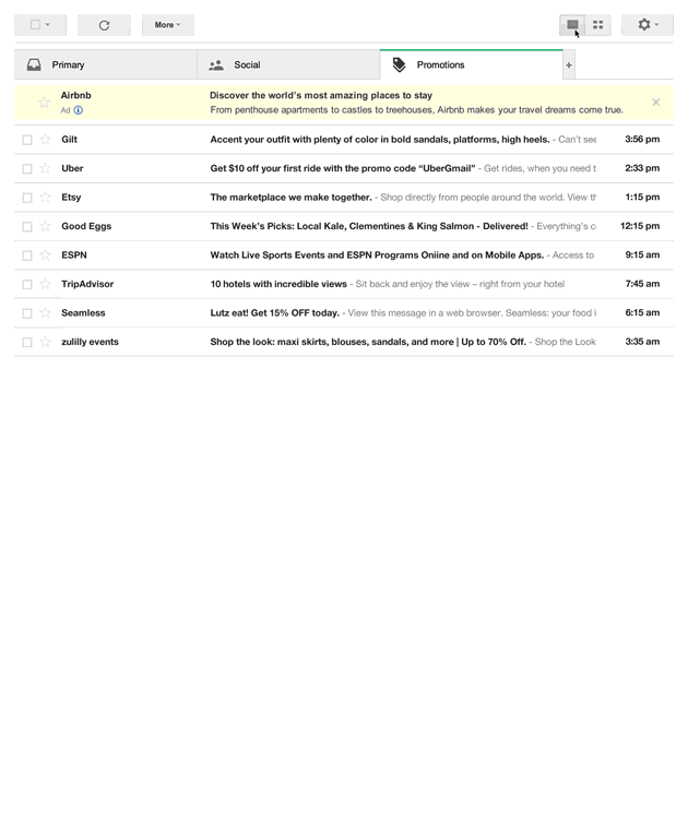 As a trial, Google needs to determine its success prior to a full roll-out and this success looks like it will be based around ad revenues as the first image is actually an ad, not an email (as is the existing differently coloured first listing in the current Promotions tab format). The appearance of the ad in the grid format is more subtle than the current listing format and will be contextual based on the emails we already receive, further increasing the chances of us clicking on ad. Sneaky, clever or both?! (It’s now evident this is also why Gmail started caching images last year).
What this means for marketing emails is that design and branding are key.
The subject line will no longer be the most important driver for email opens. A/B subject line split testing will be replaced with image split testing. That said, users have the choice to choose either the existing or grid view format so designers should still cater for both.
Send time testing will also come back into vogue – the flattening of the email interaction curve due to people opening emails at any time and anywhere has diminished the importance of when to send emails for many brands. With emails now presented in what is effectively a gallery, being as close to the top of the inbox is vital. As with many websites, scrolling is infinite but how far will most people scroll down in the Promotions tab?
Whilst there is no information on whether grid view will be available in Gmails mobile app, there is no reason why it wouldn’t be and, with the layout likely to be a single column stack instead of a grid, being one of the first messages your users see becomes even more important. This is, of course, why Google have nabbed the top left spot for ads – it’s where most eyeballs will go first.
For marketers, this creates more possibilities for design creativity to grab peoples attention.
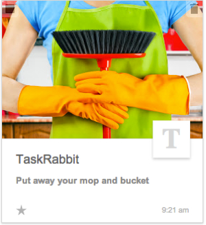
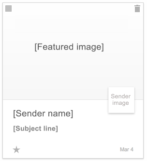
So what your email look like in grid view? Gmail will select the image to show in the grid from the email by default but, by using extra mark-up in the HTML, the sender can determine the image that is used. Note that emails that don’t use have this code are at the mercy of Gmails default choice which can display cropped images……or no image at all…
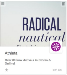
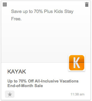
The sender name and subject line are displayed below the image and there are character limits to be aware of; 20 for the senders name and 75 for the subject line – useful to remember to avoid them being truncated.
Google further load the dice by making the sender provide information about the content when specifying the image to be selected to display – so they get more information about offers being sent and to whom they are sent. The more they know about us the more targeted the ads become and the more likely we are to click which increases ad revenues. Genius.
What this demonstrates is that Google clearly see there to be value in email as a marketing channel, despite the clamour surrounding social marketing, in-app messaging and near field technologies. In fact, Google is clearing a path for tighter links between Google+ and Gmail as the sender can include their own Google+ icon, enhancing the branding effect. If you don’t have a Google+ profile, now is the time to set one up or the logo section of the message will just display first letter of your sender name in a serif font.
How to control the image Gmail displays
The elements you can specify are these:
The featured image must be at least 580px x 400px. Larger images will be resized to be as small as possible while ensuring both its dimensions are greater than or equal to the corresponding dimensions of the available area.
<script type="application/ld+json">
{
  "@context": "http://schema.org",
  "@type": "Offer",
  "image": "http://www.example.com/product_image.jpg"
}
</script>
The sender image, such as a company logo, is taken from a verified Google+ Page which must be specified using the EmailMessage.publisher property.
<script type="application/ld+json">
{
  "@context": "http://schema.org",
  "@type": "EmailMessage",
  "publisher": {
    "@type": "Organization",
    "name": "Google Play",
    "url": "https://play.google.com",
    "url/googlePlus": "https://plus.google.com/106886664866983861036"
  },
  "about": {
    "@type": "Offer",
    "image": "http://www.example.com/product_image.jpg"
  }
}
</script>
The sender name and subject lines need no special treatment – Gmail takes them from the email – just remember those character limits.
So will it take off? The chances of the visual inbox (or something very similar) becoming more than a trial are high as Google continues to invent ways to drive ad revenues.
It’s time to get those thinking caps on and decide which image you want to appear and how best to present it. Text on images may well be making a come back!
You can sign up for the grid view trial inbox here.