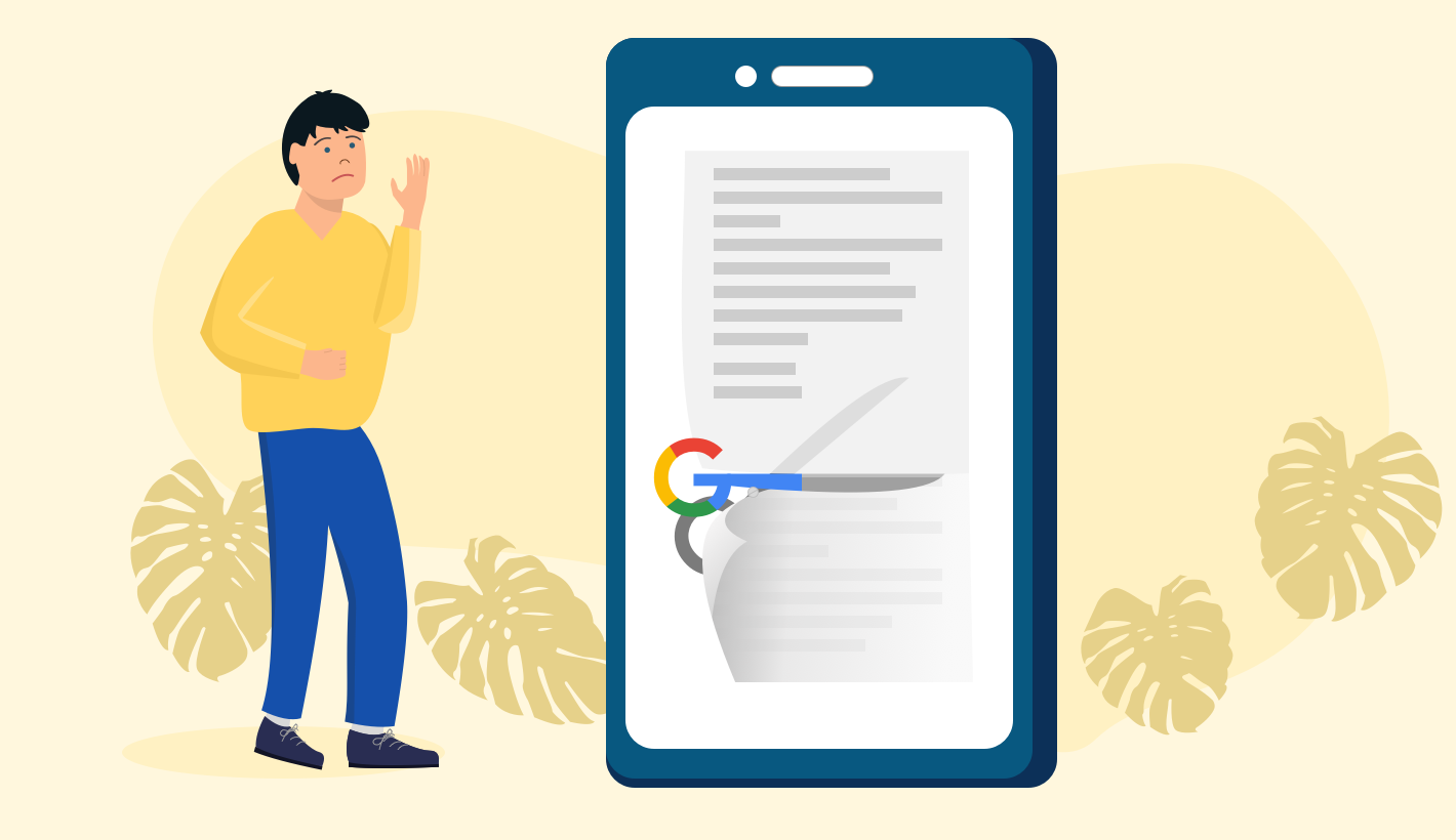
The inbox is a competitive place. Marketers strive to craft compelling subject lines which shine that little bit brighter than the rest. But only so much can be done with clever wording and look-at-me emoticons. Fortunately, Google has made the playing field more interesting. The Gmail application on iPhone and Android now supports email annotations. That sounds pretty dull, so let me rephrase it: it’s now possible to serve up additional content – including imagery – before an email has even been opened. Let’s take a look at the options by following Fictitious Travel’s quest to stand out from the crowd. Stage 1: unannotated email Nobody loves January. The people at Fictitious Travel know that, so they’re running a winter…
gmail
Responsive Email at the end of 2016
So, during the mid 90s the web standards movement was started and W3C was formed. The World Wide Web Consortium (W3C) is the main international standards organisation for the World Wide Web. The web standards movement had a large influence on the internet of today from initially pushing the idea of using CSS to style web pages all the way to adding accessibility to web pages. Creating a widely accepted standard in the various web technologies – CSS, HMTL and JS – allowed the web to accelerate as well as ultimately bring the various available browsers to offer an almost uniform experience across the web. During this period email marketing remained largely unchanged. Email marketing emails were built much like…
Gmail changes the game for email (again!)
Some of you will have spotted a trial of a grid-style (almost Pinterest-like) visual inbox for the Promotions tab in Gmail. The Promotions tab (where all marketing emails now generally end up) now displays thumbnails allowing users to see elements of your marketing emails. As a trial, Google needs to determine its success prior to a full roll-out and this success looks like it will be based around ad revenues as the first image is actually an ad, not an email (as is the existing differently coloured first listing in the current Promotions tab format). The appearance of the ad in the grid format is more subtle than the current listing format and will be contextual based on the emails…
Quick Tip Guide: 5 Basic Tips to a good landing page
There is an art and a science to making your landing page stand out from the crowd. It is imperative that you do something to capture your audience and ultimately make them follow the call to action that you have established. It is so much more cost effective to capture and engage your target market time and again that it is to buy them with SEO, Banner Ads, PPC or any other paid for advertising. Your brilliantly designed landing page can have all the results that these marketing tactics can do and more. Here are our 5 basic tips to designing a good landing page: Headline It You used to have just two seconds to make a good first impression…
Size Matters – and 4 Other Ways to Improve Mobile Email Marketing
In this day and age all email should be designed with mobile in mind. Over half of all emails are read on a mobile or tablet. 80% of emails are deleted especially if they don’t load. That’s the equivalent of 40% of your whole database and 40% of your potential revenue or white paper downloads, event registrations or survey participants getting lost. Your mobile email marketing design should be instantly recognizable and reflect your brand and consistency is crucial. Having a strong set of Brand Guidelines can really make a difference in creating eye-catching, content rich emails with a purpose and positive results. Here are our 5 quick tips to make sure you are heading in the right direction: SIZE…