
Welcome to the first of my upcoming series in which I’ll be analysing various emails I receive. Seeing what they’re doing well, what they’re doing poorly, and what I would change.
This email analysis will primarily be from a design and code basis, rather than on a strategic level.
We’re going to kick off the series by analysing this email I received from Virgin Trains.
To see the full email, click here.
First Impressions
My first impressions of this email were very positive; I enjoy the colour scheme with the contrast between the reds and whites, the modular email design does a great job at splitting up the content in a readable fashion, and I was very glad to see it also renders well on mobile devices.
Layer by Layer
Now lets break the email down section-by-section.
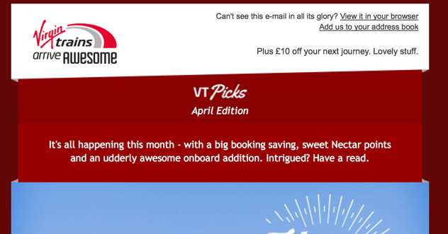
Header
The header section follows a very regular pattern featuring a logo in the top left and a View in browser link in the top right. It also has a call for the subscriber to add the email adress the email was sent from to their address book, and a bit of a subheader too. It’s a fairly standard section as I mentioned, but it looks good and renders well on mobile devices:
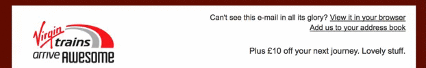
Introduction
In the introduction section, as I’m calling it, they have used different shades of red to bring the content out and making it clear it’s an introduction. It’s a nice looking section that just features a few sentences to let you know what you’ll get by reading into the email. Once again, it responds nicely on mobile:
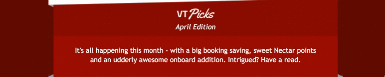
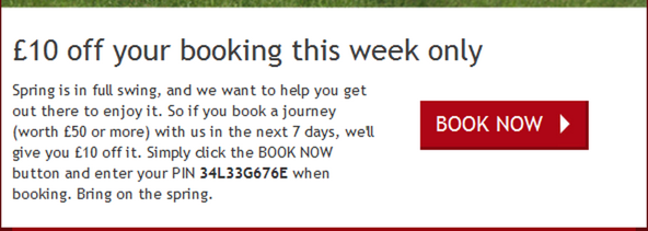
Hop to it
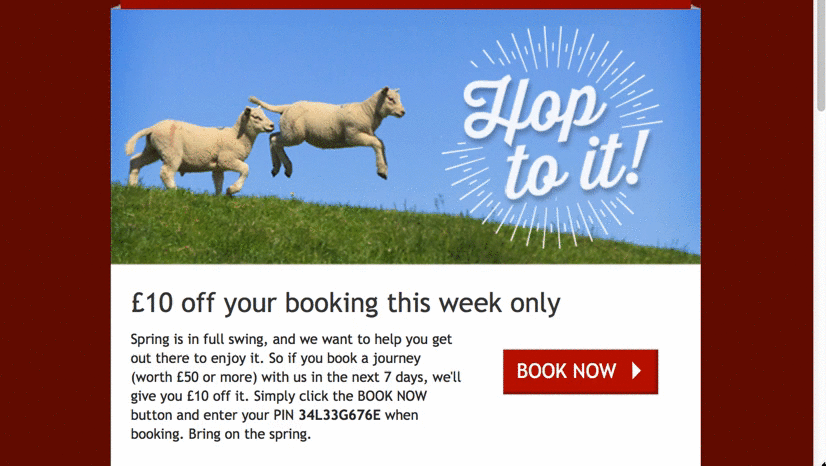
The first proper content block of this email, although they all follow similar design styles. It features a large hero image. Although this hero image doesn’t feature anything about trains or destinations, it does feature a typical spring image of lambs which is good choice seeing as the offer is a spring time offer. It then has a clear header which lays out exactly what the offer is. The next bit is a two column split between text describing the offer and a call-to-action.
The CTA ticks all the boxes for me; it’s clear it’s a CTA by the use of colours and the arrow image, it features an action in the words BOOK NOW, and it is created as a HTML element rather than an image. Here’s how it looks with images disabled:

In common with the previous sections, it looks good on mobile devices with everything scaling in and the CTA falling below the text:
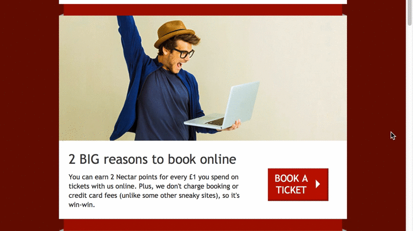
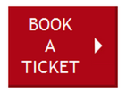
Reasons to book online
The next content section follows exactly the same design as the section above, using a fairly ambiguous image followed by a header that describes the offer. Then a two column section with an actioned CTA (Book a ticket) and a bit of extra text describing the offer. Here is how it responds for smaller devices:
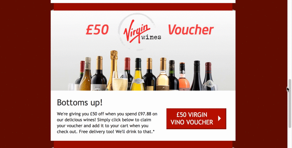
Cross-sell offer
This section follows the same design pattern as the two sections above, but this time uses a specific image describing the offer with the header there to add colour. The CTA also features less of an action and more of a description in the words (£50 Virgin Vino Voucher). As all of the previous sections, it works well on smaller screen sizes:
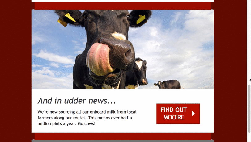
In udder news
This section, like those above, follows the same design pattern, looks great on mobile devices and continues with the informal and humerous theme:
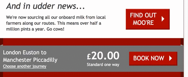
Offer
This section is a little different to the rest rough the use of a grey background and a two column layout. In the left-hand column we have the travel route of the offer. In the right we have the price and the Book Now CTA. This section works very well, in my opinion, because it really breaks away from the rest of the email. It responds nicely too, with the price and CTA falling below the route:
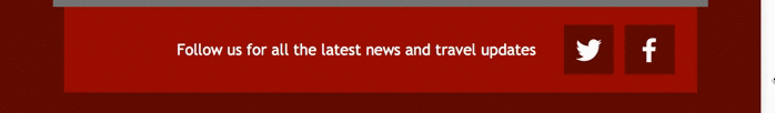
Social
Again, this section uses a different shade of red to bring it out from the rest of the content. It’s a fairly simple section; two social media buttons and a call to action to follow on the platforms and stacking the content nicely with the icons falling below the text when viewed on smaller screens:
How it renders across email clients
Now for the big test for all emails; how it renders across different email clients.
If you would like to see how it renders across all different email clients, you can do so here.
The only two things I picked up on were that in Outlook 2002 and 2003, the content in the main sections sits to the left and has some incorrect spacing;
This is because they’ve coded it in a way they have tables centered inside tables, they just need to force that spacing rather relying on aligns to center the content.
The other thing is that in web clients on Firefox, one of the buttons needs a bit more width to fit all the content in:
Both of these changes are fairly simple.
From a code point of view
Taking a look under the hood, they’ve been thorough with the code. As we have mentioned above, it is mobile responsive so it gets a lot of points in that department.
The only thing I found strange was that for each of the content sections, rather than resizing the images to the width they want them using media queries they replace the images altogether. Resizing them is fairly simple and doing it this way, with multiple images for each section, forces the user to load in two sets of images. Not a major issue but it may slow down loading speeds on slower connections.
They’ve covered all their bases with stuff such as border=”0″ and alt tags. Nice job Virgin!
Summary
Overall this is a very cleanly coded email, it renders well across all the major email clients and looks great on all of them. The email itself has a nice, light tone of voice and uses good quality imagery to convey it’s point.
This was a nice email to kick off this series, I very much enjoyed breaking it down.
If you have any opinions about this email, be sure to drop a comment into the comment section below!
Hi Alex, for some reason the Litmus link to view he email in other clients is unavailable?
Thanks Jody! all fixed now.
Hey Alex,
Very cool – I really like these articles where the experts pick apart existing emails! I think I noted was the styled ALT text – it is there in places but could by alot stronger. eg: Hop to It header, etc. But otherwise really good looking email in my opinion.
Thanks for the positive feedback Jody!
Good points, in my next one I’ll definitely take a closer look at how people are styling ALT tags.
In this one, they’re actually including the spacers between sections in the image. I think if they skipped on that they could have been even stronger with them too.
Great post Alex! I like the way you present your analysis – direct to the point and very well illustrated. Congrats for that!
About this particular email, I agree they’ve done a good job overall with the design and the content. The only thing that bugs me is the fact that it’s not displaying properly in Gmail App (as seen on litmus results).
I know Gmail (web and app) doesn’t support medias queries, but personnaly, I try to opt for design choices that cope with that, in order to ensure a proper rendering on Gmail mobile clients. Having the button and the text on 2 columns in the mobile view is a design disaster.
Since Gmail and mobile are taking more and more importance everyday, I think the design and coding should be rethink a bit to deal with this.
What are your thoughts on that?
Looking forward to reading your next posts 🙂
Hey Jerome, glad you enjoyed the post.
Regarding the Gmail app, it’s a very good point you make. The way I see it, they have two choices they can make to deal with it (excluding praying to every God there is that Gmail will soon support media queries!) Moving to a one column design as you suggested, or a “fix” we tend to do which is forcing the Gmail app to render the desktop version. Although it isn’t ideal, it’s better than Gmail trying to bump around the font-sizes to compensate as it seems fit.
Like you Alex, most of my emails are using a fix width for Gmail… This method, combined with an email that is not too complex, makes it a sure path, at least for now.
But I will try to use the Hybrid Coding Redux (http://labs.actionrocket.co/the-hybrid-coding-approach-2) a bit more to make mobile first email and get an even better result for Gmail and other clients not supporting media queries.
Sounds good!
Let me know how you get on with Hybrid coding.
Hi Alex,
This is a really good way to break down an email. I look forward to reading more of these in future.
On a separate note, i would have considered a landing page for terms and conditions as perhaps a better way of displaying them, as currently they get a little lost in the red.
Also may have been a nice touch to personalize the offer in the grey box based on geographical location.
All in all though a very solid email, well done Virgin!
Hi Luke, thanks for the positive feedback, looking forward to your opinions on the future reviews!
That’s a good point about the T&Cs, I wonder if they could have condensed them down maybe?
Also geolocating the offer is a great idea – good thinking.
Nice email to start this series of posts, Alex. Looks like a solidly built and nicely designed email. Share Jérôme’s thoughts on the text alongside the CTA when it comes to the Gmail app.
Personally, found the design good, but a little one note. Sure the contrast between the red and the white is good, but the dark red for the background colour was a bit too heavy for me. Though, thinking about it, can’t imagine many people would really see that.
And that footer! I get that we have to put some Ts and Cs into emails to cover ourselves, but holy moly!
Glad you enjoyed the post Jaina.
In regards to the background colour, I can see your point. But, like you mentioned, not a lot of people are going to see that, they may only see a tiny bit in their Gmail or similar inbox.
I actually coded this email. Strange to read someone reviewing the code.
Glad most of the feedback was positive, though to explain why the images are not fluid in this email. Virgin sometimes use a different URL for the desktop and mobile images, which can’t be done easily if you’re using one image. As for the older versions of Outlook, even microsoft barely supports them, so we’re not too worried about small spacing issues in those.
Thanks again for the review.
Hi Anthony, great to meet the developer behind this great email!
Thanks for explaining why you’ve done the images like you did, definitely makes sense.
Same with Outlook.
Happy coding!