
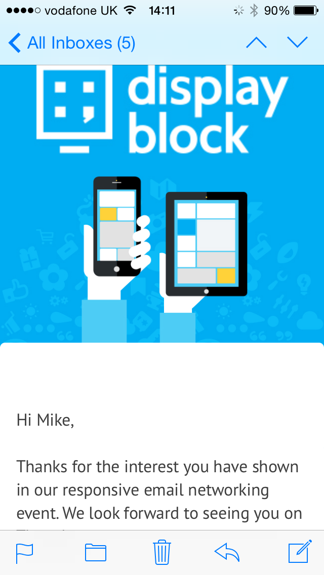
I think we all agree that people look at their phones a lot, I think we all agree that they are looking at your emails on their phones, the numbers are compelling and all retailers are seeing in excess of 50% of their opens on devices, most b2b’ers are seeing 30% plus, the jury are in and the verdict is people are looking at your email on their device.
The question then is not are they looking but what sort if experience is your brand giving them? Truth be told, with most marketers it is a less than perfect user experience. Low res images, text over images, text that isn’t “live”, email that is poorly designed for devices, a one size fits all email approach. These are just things I’ve seen in my inbox before and not by ma and pa retailers trying to make their way but by huge retail corporations, some of whom have done better and just got lazy. Mobile optimised or responsive email isn’t about you the retailer, it isn’t about getting immediate revenue uplift from today’s email. It is about the user, it is about giving your email user the best possible experience when engaging with your email. It’s about increasing the lifetime of your user and your users engagement with your messages. It’s about reducing list churn, it’s about a continuity of experience from the responsive email to the responsive website. These things are the long game, they are long term ROI winners, they are not about increasing spend today, although, invariably a well designed responsive email tends to work better the long game is where the real benefit lies.
So what are the basics of responsive email.
High Res images, I know this almost flies in the face of mobile optimisation because you are thinking, users on the go wont have as good a wifi signal and we don’t want the images to take ages to download. The truth is, most people have decent internet on their phones and screen resolution is improving all the time. Low res images look low rent.
Image off optimisation
With the above in mind, you need to look at how you design your emails to look when images are turned off or while they are downloading. Using font sizes, background colours, a smart design, descriptive alt tags and in some cases pixel art can give your user a really good idea of the email content and why they should engage with the email before they even see the images.
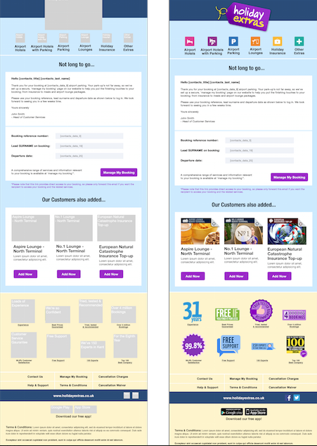
Remove text from images
This one really scares brands, the reason most have text on images is because the font their brand uses is not web friendly, and as such, highly unlikely to be on their users PC, laptop or device. No problem, make it an image and the user will see what we want them to! Well if in order for them to do that they have to do the reversed 2 fingered pinch to zoom in to your image and the copy within, well guess what, the image is likely to pixelate and give a bad branding experience. The reverse 2 fingered pinch means that I am out of the body of the email so actually I have lost the message to read one or two words in an image and my branding experience is poor. So the purpose of the text over image, which was to give a good branding experience has in essence served up the opposite.
However the real benefit of removing the text from the image is greater even than to improve the above branding experience. Moving the copy out of the image and making it “live” copy means that you can increase the font size depending on the device and screen size, thus getting your message across to the user in a fashion they can see and engage with easily.
Design in rows and columns
Responsive email is best designed in rows and columns, think of your email as building blocks and each block will need to be stacked on a device into one or two columns depending on the screen size. As such, intricate designs that look great on your desktop will render poorly on devices. Stacking can be done, left to right, right to left or you can alternate it, indeed you can choose depending on your lay out, each element just needs it’s own comments in the code.

There are many more complex and clever ideas you can bring to your responsive email design, we have only covered the basics here but you can really push the boundaries once you understand the principles.