To improve the effectiveness of your emails it is important to not overwhelm users with choice and to not include any content with duplicate links. This concise approach to email design will not only improve the results of your campaigns but also reduce the time it takes to create them.
Keep things simple
People can easily be paralysed by choice. It’s easy to be quickly overwhelmed with possible options. The process of incrementally introducing information or options has been something the web has done well for decades now. You don’t need to show every colour shoe in your email. Sell some shoes first, get the person to visit your store and only then should concise email design slowly, incrementally offer more options. Which style? Which colour? Which type? Which size? What extras would you like? Trying to accomplish this process within an email, although it is technically possible with modern kinetic emails, is jarring and uncouth. Email is the first point of contact, the very initial interaction, it should not be used to sign and seal the deal. Email should be used to entice, seduce and most importantly start the process of completing the sale, not facilitate it.
Email should be used to entice, seduce and most importantly start the process of completing the sale, not facilitate it.
Space is limited
Space in emails is limited by the amount of time people are prepared to glance at them. This leads some people to believe in a concept called the ‘the fold’ which roughly equates to “put all the most important content at the top”. This has been largely disproved as myth, however links do perform better the higher they are on the page. The opening glance of an email needs to quickly achieve quite a few things. It needs to convey its purpose i.e. is it a Sale email, newsletter etc.? It needs to clearly identify itself, who it is from and lastly it should at least begin to fulfil its purpose, i.e. if it is selling shoes the reader should at least start to see some shoes at first glance.
Stolen design is lazy design
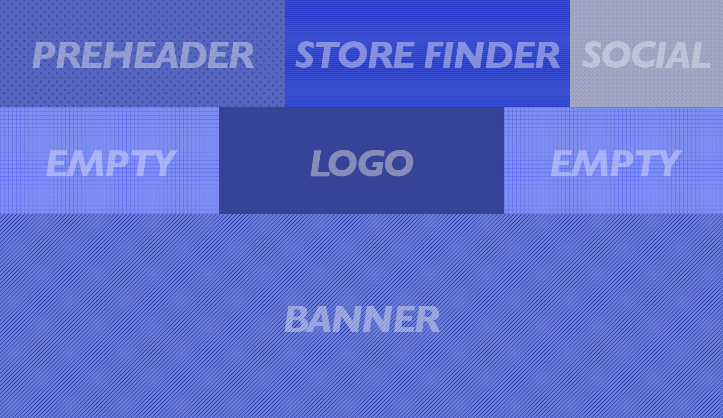
To achieve these goals in email design designers employ many solutions borrowed directly from web design or print design. To solve the problem of identifying the sender a large logo is often used. To convey purpose or provide functionality a faux navigation bar is used. To convey the email’s purpose a large banner can stretch across and down the entire view of the email. This top space also usually needs to contain ‘view in browser’ links, a pre-header line of text and possibly add to address book instructions. Social media can also be inserted into the top sections of email. All manner of other types of content can find itself into top sections of emails. Store finders, telephone numbers, addresses and all such content are better suited to being further down or in the bottom of emails.
Optimise the use of space
Since space in email is very limited including duplicate or redundant content within emails not only wastes space but reduces the effectiveness of the links. Keeping the content, design and links concise will maximise the effectiveness of the email.
So, how can brands tackle all these problems? Joe Harrison created a fantastic concept for responsive logos. Where logos gradually decrease in size based on screen size. I would suggest brands take this idea and make a smaller versions of their branding specifically for email.
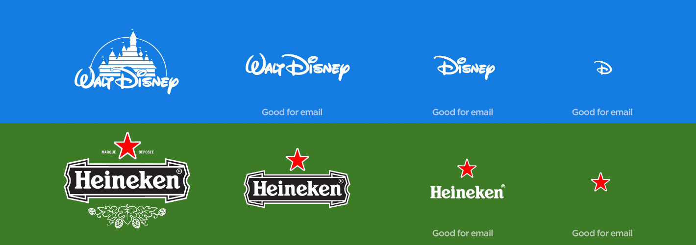
Clean up essential items
Pre-header text can be hidden so it only appears in the preview screen and not take up actual space within the email. The view in browser link usually doesn’t get many clicks and so I think it could easily move to become normal footer content.
Re-purpose navigation bars
Navigation bars are probably the worst feature from web design that has crept into email design. At its most base level no matter which link you click you leave the email and land on a web page. Sure each link takes you to a specific web page but you could just have one button saying ‘visit website’ and achieve the same result. Trying to recreate the complexity or options available on a site can easily be shown by looking at this asos.com example. It would be nearly impossible if not very foolish to try and recreate their navigation in email. So they haven’t! Instead they have re-purposed the navigation to be a very direct selling tool. Creating a small collection of links to direct their readers to exactly where they want them. Yes, but that’s what navigation is I hear you say. No, the navigation in email (which is bad) is the carbon copy long list ‘nav’ that exactly replicates the web site. A good email ‘nav’ is a small concise list of links which further help the email fulfil its purpose.
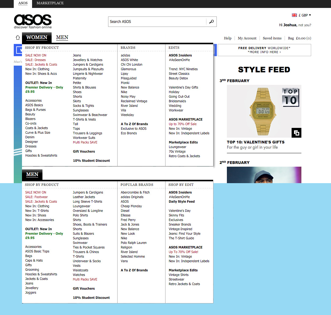
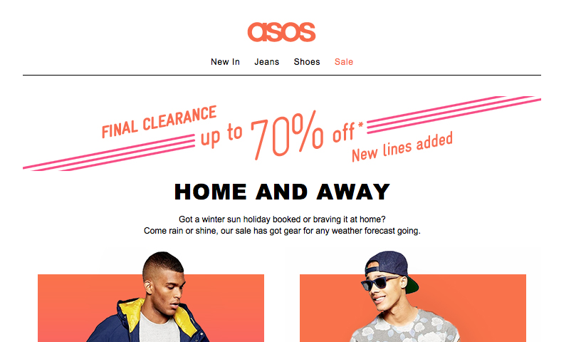
Navigation bars are probably the worst feature from web design that has crept into email design.
Remove duplicate content
Probably the worst or biggest crime in email design is duplicate content. So often you will have sections that might differ graphically but still send readers to the same place. These sections should be dropped! They waste the recipient’s time and confuse the design. All these sections in this GAP email direct readers to the same location.
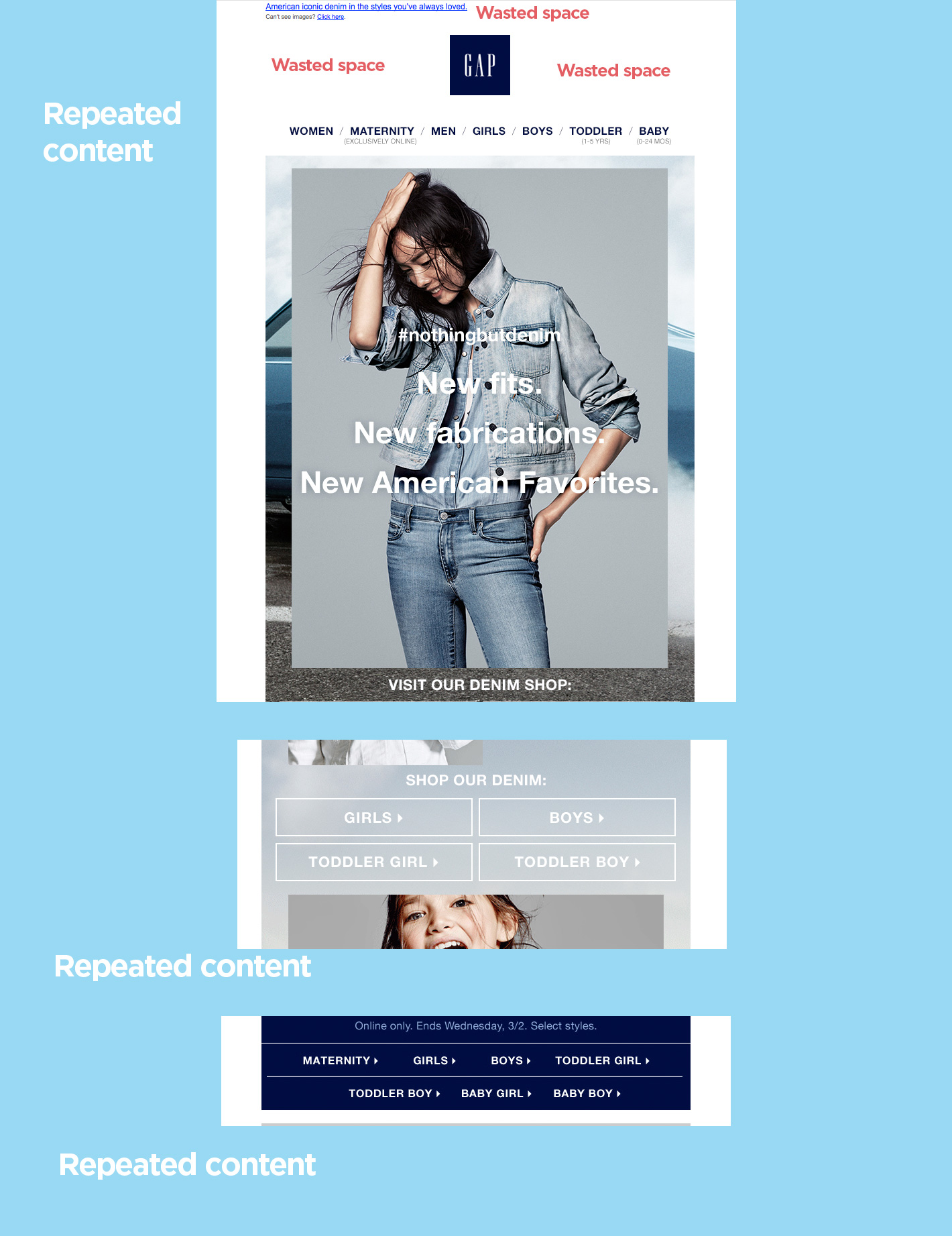
the worst or biggest crime in email design is duplicate content.
I would like to reiterate I am not continuing the myth that there is a fold, I am saying all space is valuable and all space should be used efficiently. Optimising the headers of email is being focused on because that is the most badly designed section of most emails.
Email design is a different discipline, it shouldn’t be a pared down version of a web page. Email designers need to drop the nav’s, headers and use special email specific logos.


“Navigation bars are probably the worst feature from web design that has crept into email design.”
True dat!
There are probably a few others but when you think about how expansive modern navigation can be trying to include them in email seems impossible.
So is the example given supposed to be bad or good? I don’t see anything offensive by having that collection of links (especially if they A/B tested those and not having ones at all). It doesn’t take that much space to not have it, and its obvious specifically segmented (since its geared towards Males without a Female link).
Also that advice is very specific to that brand: GAP caters to families and having multi genders might have a higher ROI than just a blanket categories.
I agree that pointless nav bars are pointless, but creating extra links to relevant content at the top can be very useful (ie: a sign in link for an app requiring logins)
Totally agree with the nav bars 😉