

Making the navigation responsive in mobile emails is a key area in improving usability by offering functional links to a message and guiding recipients to your site, even if they aren’t receptive to the particular message or offer in the message itself.
Today, on average, half of all emails are opened on a mobile device so it’s critical to ensure they are easy to read and interact with whichever device they are being viewed on. Thanks to responsive email techniques you can choose different email design patterns when it comes to navigation.
Reduce the number of items
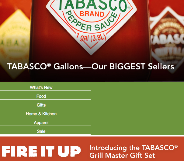
When you look at the mobile version of an email, the first tactic that comes to mind is to reduce the number of navigation items that are visible on the desktop version to make the list concise and simpler when viewed on mobile devices. This is also not a bad the time to review how many items to include on the desktop version by thinking what it is you actually want people to click through to on your site.
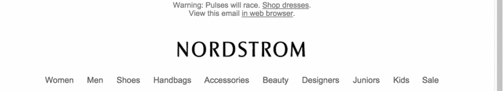
In this example you see that Nordstrom has kept the group items categories; women, men, junior, kids and sale – and removed the product groups; shoes, handbags, accessories, beauty and designers.
Double row reduction
REI have two rows of navigation items and have shortened the names of the top navigation row items whilst reducing the second level items to the initial three.

Stepped reduction
Here, Nasty Gal, has used multiple breakpoints, so the navigation adapts completely to screen size, which is pretty slick.

Replace
In addition to reducing the number of items, the design itself can be changed. In this email by SweatyBetty the the text navigation on the desktop version changes to buttons when viewed on a mobile device.

Hide
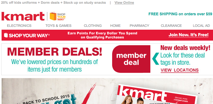
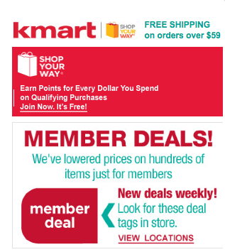
Deciding on which items to display should be driven by your email results. Are there enough clicks on navigation links from mobile to have them taking up valuable screen ‘real estate’? In this email from kmart, the navigation has been hidden completely for mobile users to improve focus on the main message.
Top to middle
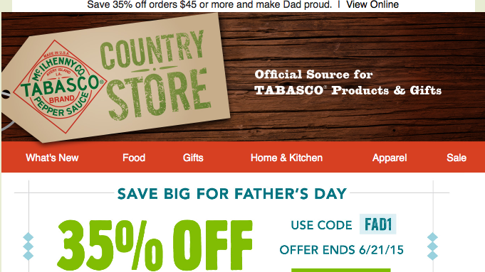
In their email, Country Store move the navigation for mobile under the lead offer. A very elegant way of dividing the priority between the main content and the navigation.
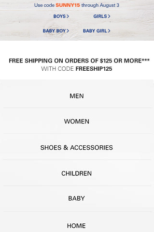
Top to bottom
For their mobile version, Ralph Lauren jump the navigation from the top to the bottom of the email and from horizontal to vertical making it easy to read and to tap. The thinking behind this tactic is that the content comes first and then the navigation is a “catch all”. But expect less people to make it to the bottom of the email and click on them. Also consider a double column instead of a single column.
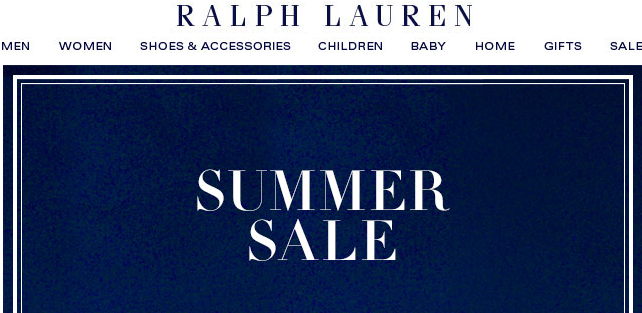
Afraid people won’t find the nav bar? You could add a footer anchor at the top. Here is an excellent code example of that by Brian Graves. It looks cool, although one can argue that such a link makes more sense linking to a landing page or even an online version that shows the navigation.
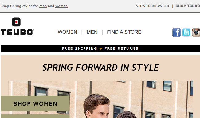
Shift
In this Tsubo email, the number of links on the desktop is kept in the mobile version but i’d recommend limiting this option to no more than five navigation items. In the mobile view they are shifted, moving other horizontal aligned elements (in this case the logo). This is quite easy to code.

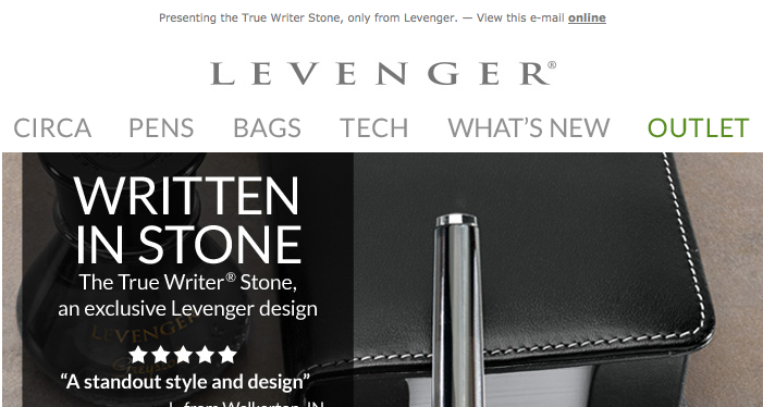
Stacking
As with general content for mobile emails you can stack navigation items into two or more rows as Levenger have done here. This keeps every item clearly visible but does take up more room so can distract from the main message.

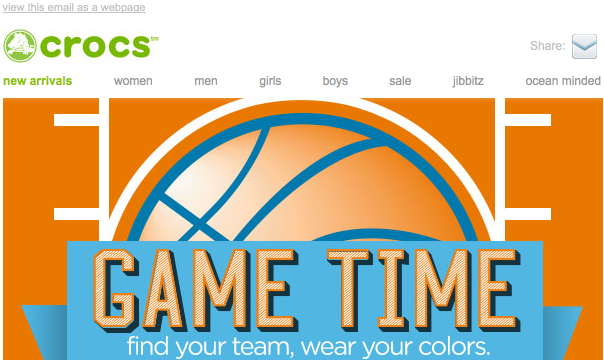
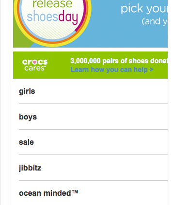
Split
Want the most important links at the top, but don’t want to hide the rest? Let’s split the difference. In this Crocs email, one section of the navigation is kept at the top, the rest goes under the content so you can keep everything with the most essential items “above the fold”.
Crocs tested desktop vs. mobile years ago with the mobile version giving a 7.7% uplift in clicks and a ‘read’ engagement increase in 15.6% increase on iPhone. However, this uplift didn’t improve overall conversions so be sure to measure on the right metrics in any email marketing split test you come up with.
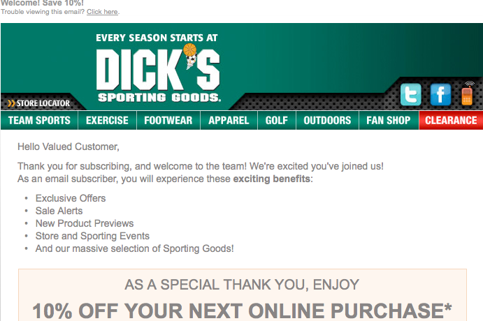
Wrap
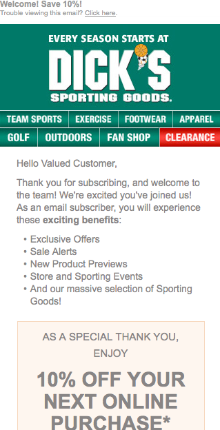
Dicks Sporting Goods have chosen to wrap the navigation on their mobile version. This should be pretty easy to implement and is not seen that often, possibly as it takes up more space and can look messy. With this tactic you should keep the padding.
Conclusion
Optimising for mobile means more than making it mobile friendly or responsive and my estimation is that over 90% of brands do not fully optimise their mobile version and dive into mobile head first. As we have seen there are many possibilities when choosing how to display navigation items in email – even at this basic level. Next time I will go into some more exotic possibilities. In the meanwhile do comment on the ones you like and your experiences on mobile email optimisation.

Jordie van Rijn is an independent email marketing consultant has a love for coffee and well executed email and marketing automation strategies in the morning. With over a decade of experience, brands like KLM, Unilever and Eurail turn to him for advice.
I’m always at odds with “navigation bars” in email. Because they don’t really navigate to anywhere in the email, but the site. They’re click-throughs. So if they’re important enough, and generate enough clicks/conversions, surely they should be a more important part of the email itself?