
Welcome to the third instalment of my email analysis series!
For this weeks review, I’ve picked out an email which was suggested on Twitter by Chris Goldson for analysis; a Manchester City post-match email.
You can see the full email here.
First Impressions
My first impressions of this email were a mixed bag. Although the email uses some design techniques I’d consider a little out-dated such as borders around images and a gradient behind the navigation, the overall design looks nice. The email has a lot of plain text, rather than text as images and features a variety of different layout elements to form a post-match report. I’m also glad to report it is optimised for mobile devices!
Layer by Layer Email Analysis
Now lets break the email down section-by-section.
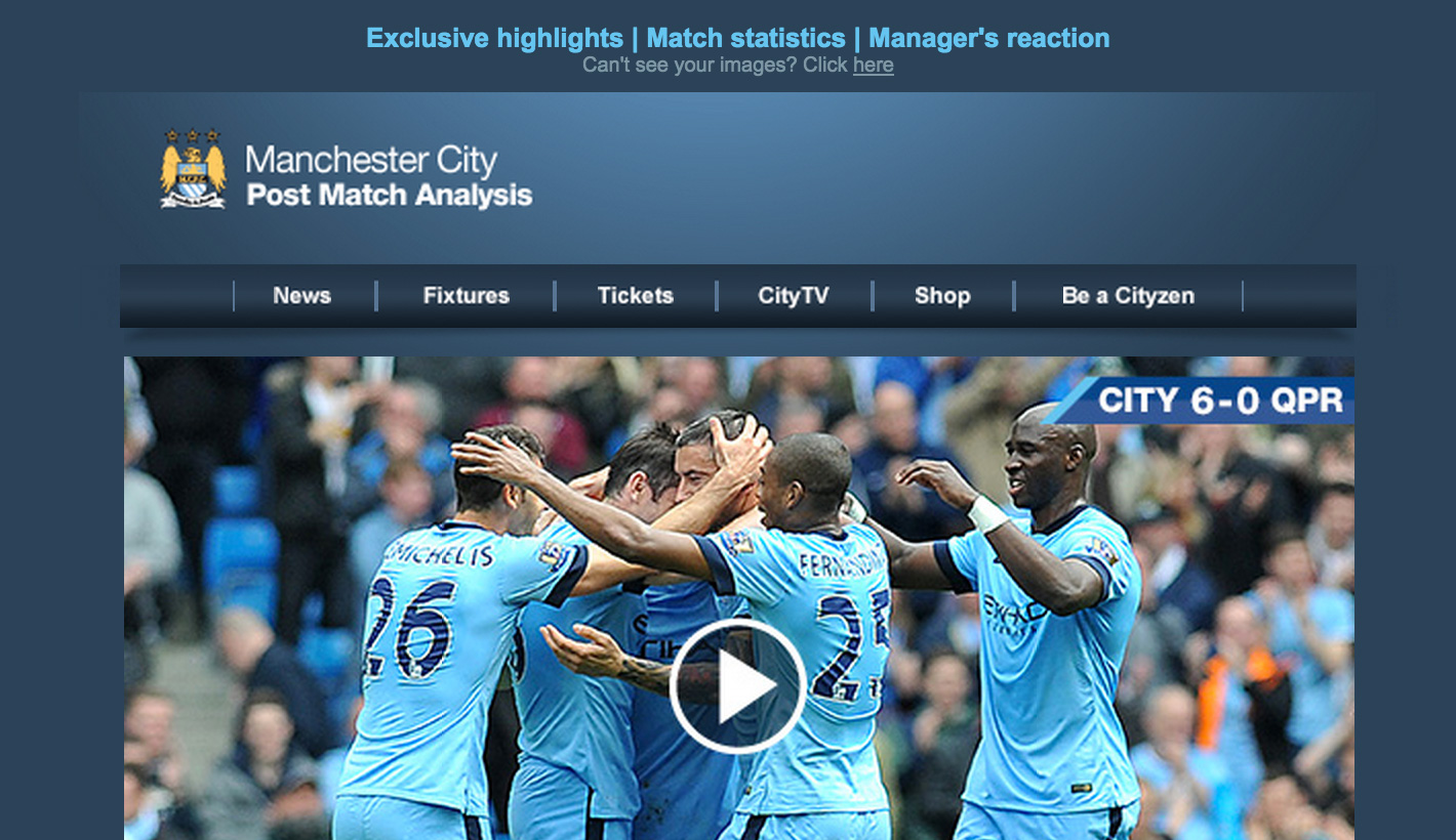
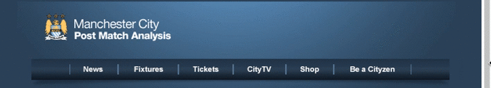
Header
The header features the Team Logo accompanied by the title of the email. Below that is a navigation bar. Both of these elements feature the “out-dated” design styles I mentioned in my first impressions paragraph; the Logo has a gradient behind it, as does the navigation and the navigation also has a shadow underneath it. But, once again, the design is not unpleasant and they pull it off.
When it’s optimised for mobile, they simply drop navigation items to fit the screen.
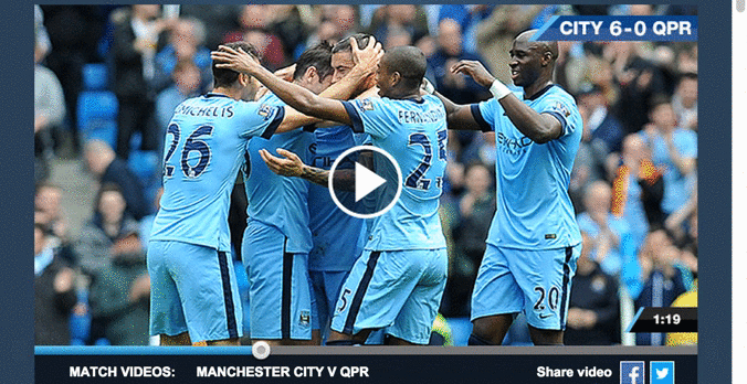
Hero
The hero section looks really nice, but there’s more going on here than meets the eye.
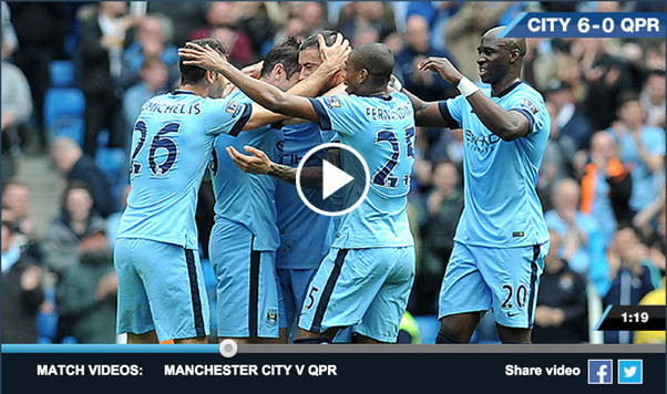
It looks like you can just click play and watch the video, nothing too special, just what we usually see. But what I really like is that they’ve made it look like the video is half played, including a timeline at the bottom for added authenticity.
When it comes to the mobile version I like what they do there too. They’ve actually cut the large hero image into three parts and are simply hiding the left and right parts rather than scaling it down.
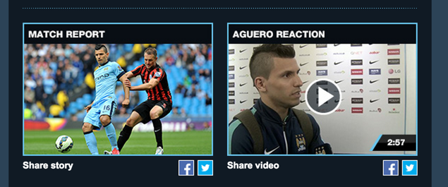
Two column
Next up we have a nice little two column section with two different bits of content; a match report and a video of a player’s reaction to the game. I really like the varied content here, some people may not enjoy watching the player interviews for example, so they’ve done a good job in covering content for everyone. On mobile devices they simply stack the two column section into a one column.
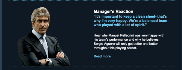
Manager’s reaction
Now we have another little two column section. The left hand column in this is a nice transparent PNG of the manager, the right hand column is a nice little excerpt from the manager’s post-match interview followed by a strong call-to-action to click through and read the rest of it.
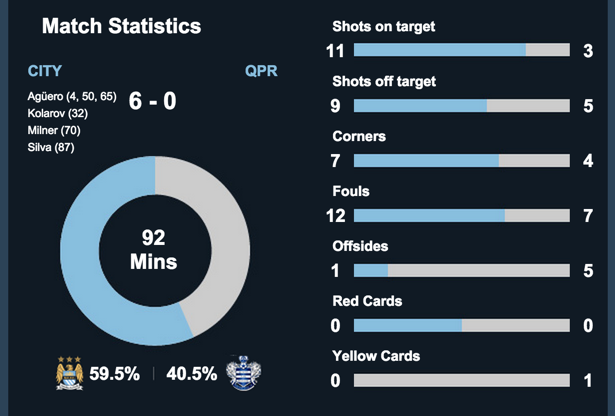
Match statistics
Another two column section up next, but this one is really well designed and very appealing. They’ve added in the statistics from the match in a brilliant way, allowing the reader to digest the information in a infographic-esque way. The mixture of graphs and plain text to display the content means that it scales beautifully in mobile, and even displays fairly well before the user enables images. I’m very impressed with the effort the designer and developer have gone to for this section. Although I suspect OPTA may have had a hand in this one!
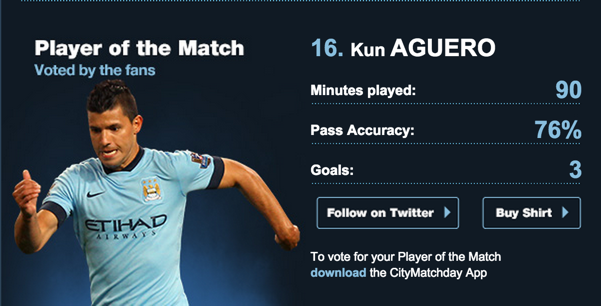
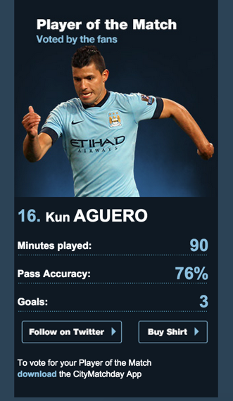
Player of the match
Mixing both of the previous sections, the player of the match section comes next. Reminiscent of the manager’s reaction above, the left hand column contains a nicely crafted transparent PNG of the player in question, in this case Kun Aguero, which stands out nicely against the plain blue background. The right hand column pulls in elements from the statistics section above to display his key match statistics and explain why he was voted player of the match. There’s a nice mixture of varying typography and nice dividing images to display this in a very aesthetically pleasing way.
This section also features two very nice up-sell buttons, encouraging you to either follow the player of the match on Twitter, or buy their shirt from the club store – very clever!
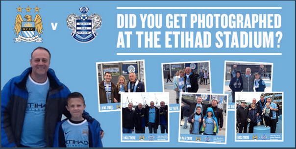
Did you get photographed?
This section is your standard promotional banner, asking readers if they were photographed at the stadium with the goal of getting them to click though and purchase their photo. The one non-standard thing from this is that they realised they couldn’t stack this section for mobile, so made the choice to cut the image into two; the first image is hidden on mobile while the second one is switched out entirely for one that is crafted specifically for mobile devices. Usually I don’t advocate this as it involves not only creating extra images, but also increasing the amount a user has to download. But in this case I think it was the right choice.
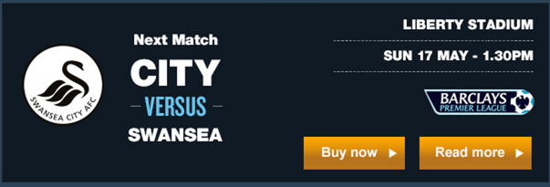
Next match
The next section reverts back to the tried-and-tested two column style. The left hand side has an image with their next opponent’s badge and some text inside image explaining who it is. The right hand section has an image with some extra detail; time, date, and location. Underneath that there are two very clear call-to-action buttons; read more and buy now.
The only thing that confuses me a little bit is the use of images for text. For the rest of the email they’ve done a very nice job of keeping text as actual text, rather than images. I don’t know if this section has a specific reason for not adhering to this, but I don’t see any huge problem with reverting that to text and keeping both the consistent look and mobile optimisation.
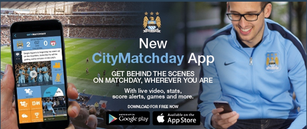
Download the app
The penultimate section is a big banner which has only one goal; getting the subscriber to download their app. Again, they have text inside images here, but we can forgive that a bit more as this text sits on top of complicated imagery that would take a lot more effort to do as text. Although it’s definitely do-able, the upshot of doing that one section like that would not equal out the effort they would need to do to cut it like that.
For the mobile optimisation, they use the same technique they used in the faked video at the top by cutting the banner into three parts and hiding the left and right parts. Nice job.
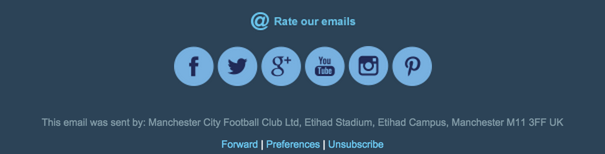
Footer
A very straight forward footer, but with one twist. It features an interesting call-to-action to rate their emails. Something we don’t see a lot of, but probably should.
This is followed by your standard footer elements; social icons, copyright information and unsubscribe.
How it renders across email clients
Now for the big test for all emails; how it renders across different email clients.
If you would like to see how it renders across all different email clients, you can do so here.
Good news, it renders perfectly across all devices.
It also looks great on Tablets and Mobile devices. Even supporting older Outlooks such as 2002 and 2003, and the new Outlook beast; 2016.
Final thoughts
Although this is a very content heavy email, I love the way they’ve split up the content and shown statistics in a pleasing way. Altogether, I think this is a fantastic email and will be using it as a future example of content-heavy emails done right.
If you have any thoughts on this email, let me know in the comments or on Twitter!
Beginning to see a few emails come through where the hero image is split into 3 for the purposes of mobile/smaller devices. Very clever way of having something long go vertical, without having to double up on images too much.
Wondering whether some of the sections that are just images, rather than text and images, is for ease of swapping in and out different images – if the image clicks through to the same location every time the email’s sent. I’ve done that in the past. Who knows.
It’s a good looking email for a football club – I get that the blue is their colour, but it’s quite heavy, feel like there could be a little bit more contrast to help with readability and scan-ability.
Yeah I’m going to bet they do the images instead of text for just that reason! It’s a rather large template and must be quite a hassle to send out each week.
Holy moly I bet this took a lot of work and testing to get it right, but agree that it came out great all things considered. I’m also quite impressed with the Match Statistics, interested to see if images-off.
Nice email and, once again, great analysis Alex!
Can you provide the source code? I’m curious to see how they made the statistics’ bars… Did they use TD with % to make this scale or simply images with a 100% width?
And the 3 parts image trick is clever!
Thanks for sharing this with us and looking forward the next one 🙂
Glad you enjoyed it Jerome!
Here’s the source code: https://litmus.com/scope/zairvnnhdv4j
Thanks Alex!