
Big Data is definitely in vogue at the moment with companies looking to find ways to improve sales and operational efficiency through analysing huge volumes of data searching for industry and commercial patterns. Whilst the expense of such an endeavour may be a little off-putting for some smaller companies, this doesn’t mean you should forget about the potential in your own data and those nuggets of insight you can glean from in-house analysis by getting caught up in the Big Data wave. Understanding your own customer behaviour is a great way to figure out where your customers are most likely to become disengaged (or disappear entirely) allowing you to target them more effectively to see if you can encourage them to hang around for longer. So, all you need to start is some basic information like subscription dates, suppression dates, open / click dates and then you can map the average user’s activity. Let’s take the course of a year as an example, to see if there are any areas that can be improved upon.
Year-on-year database growth
Firstly you can find out how healthy your database growth rate is by simply extracting the numbers of new subscribers, number of suppressions for each quarter of every year and then comparing across years to find out how you’re doing.
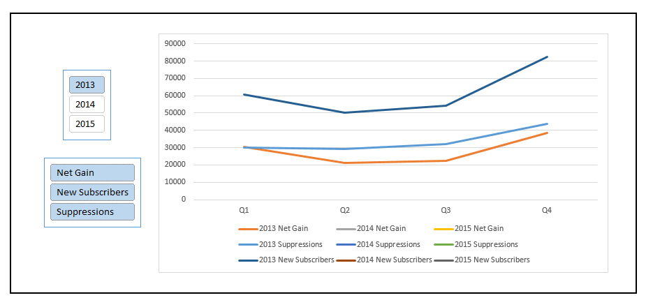
You may find out you are improving which shows your brand is growing in popularity, but some quarters may perform less well than others – is there anything to be done to equalise each quarter, or is it just natural consumer behaviour, e.g. being more active around public holidays like Christmas and New Year sales?
Suppressions
This is an example of how the suppressions could look across the year broken down quarterly:
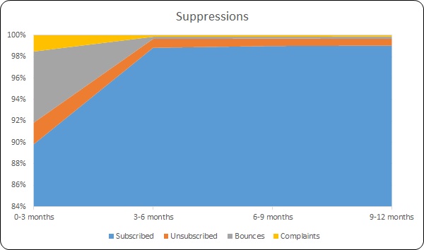
No real surprises here, the bulk of suppressions may occur within the first three months of subscription, mainly through people changing their minds about opting in and bounces (which will normally occur on the first few sends since if they are invalid they will get stripped out straight away).
There is nothing you can do about how complaints are handled by webmail companies such as outlook.com, but seeing that potentially 6% of emails get lost straight away from being invalid it may be an idea to employ an email hygiene procedure which looks to correct misspelt email domains and remove invalid characters which as our previous blog on creating such a procedure shows has historically been able to fix as many as 1% of broken emails.
To try to prevent people from unsubscribing straight away you can also think about incorporating a preference centre rather than a simple opt-out link which allows people to choose from further options, for example, choosing a different frequency i.e. only receiving emails once a month, taking a break from emails for six months or even selecting to receive only certain types of mailings which may encourage some recipients to stick around as they will feel more in control.
Unsubscribes by number of opens
With the available information it is then possible to see how many opens a recipient performed before deciding to unsubscribe from the list.
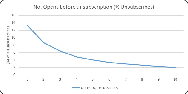
In this instance you can see that nearly 14% of total unsubscribes occurred as a result of opening only one email. So, rather than their first email being just a generic newsletter which may not wow your new customer, if you haven’t already, consider setting up a welcome programme where you can greet them personally and make a great first impression – check out our previous blog on the topic for ideas.
Open Sesame
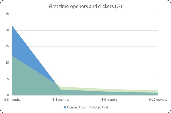
Comparing the first time openers with first time clickers across the course of a year you can see what percentage of new subscribers are actually likely to open your email (or not) straight away and how many new openers you can still pick up after three months and beyond. The graph above shows almost 10% of first time openers didn’t actually click through, although the percentage of first time clickers outperforms new openers from three months onwards, suggesting the right call-to-action (CTA) is needed to convert openers into clickers.
You may then want to consider ways to encourage more clicks, for example, by perhaps making your CTAs more obvious or attractive as part of your email design. How emails render on mobile devices is particularly important with around 60% of emails currently being opened on a mobile device – so you don’t want your links to be missed or tricky to click on – here’s some advice on how to maximise your tapping potential on mobile devices.
How often are your customers opening and clicking?
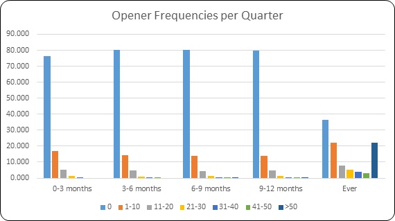
So, what can you learn about the frequency with which your customers open your emails? Here, 76.5% of new subscribers (active so excluding invalid addresses) won’t open an email in their first 3 months of their subscription. There are three things that a reader will see before making a decision – the sender, the subject line and the pre-header text. So we have a great guide for coming up with magical subject lines and for your pre-header text you should make sure you have the important information at the start – some email clients can limit you to as little as 75 characters so it needs to be snappy, attention grabbing and informative.
I’ll never know what pages I might have liked…
We can see 16.9% will open it 1-10 times and the remaining 6.6% will open it more than 10 times but less than 40. However as the subscription moves into the second, third and fourth quarters we can see some activity in the 41-50 and >50 bands which suggests that some customer loyalty has formed after 6 months or so. If you look at the frequency of opens to date there is a definite subset of around 22% of customers which could be considered your most engaged customers which is an area to focus on with regard to segmentation and increased content personalisation, and likewise those that can be considered disengaged need to be treated differently to encourage them back on board .
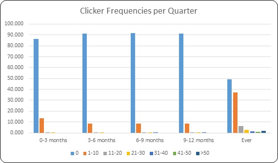
We can see a very similar pattern for the number of clicks just with a lesser percentage actually clicking through, again this kind of information can allow you to segment your data into the most engaged all the way to the most disengaged to target them with different messages.
How long are your customers sticking around for?
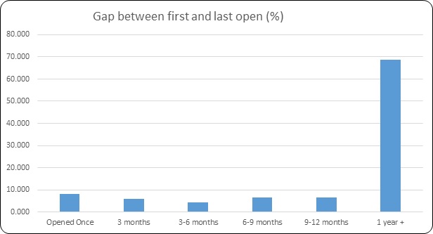
So of all the currently active customers we can see in this instance that just over 30% stop engaging within their first year and almost half of those within the first three months. One possible strategy you may consider is a reactivation programme, perhaps offering better deals to your lapsed customers to try to encourage them to re-engage. However once customers remain non-engaged for a certain time period, over 12 months for example, it’s wise to consider dropping them from your list as older data runs the risk of containing spam traps which has the potential to harm your sender score and affect deliverability.
So, armed only with the most basic of information like subscription dates, suppression dates, open and click dates there is a whole world of insight available at your fingertips to help to improve your customer lifespans.