
Welcome to the second instalment of my email analysis series!
For this weeks review, I’ve picked out a Homebase email from my inbox.
To view the full email click here.
First Impressions
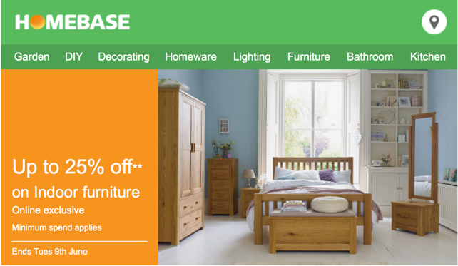
My first impressions of this email were very good. I enjoy the Homebase colour scheme, the contrast of the orange and green works well for me. The email has a lot of plain text, rather than text as images and features a variety of different layout elements. I’m also glad to report it is optimised for mobile devices!
Layer by Layer
Now lets break the email down section-by-section.
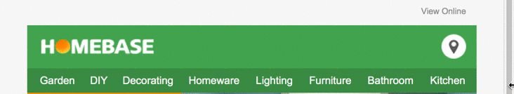
Header
The header follows the usual pattern of having a View in browser link in the top right. It then breaks into the logo section, with a logo on the left. This email also features a Store Locator button in the navigation, very cool! That’s followed by a fairly busy navigation, with a lot of links on it. On mobile devices it is much the same story, the only big difference is it hides half of the navigation links, only leaving the core four there.
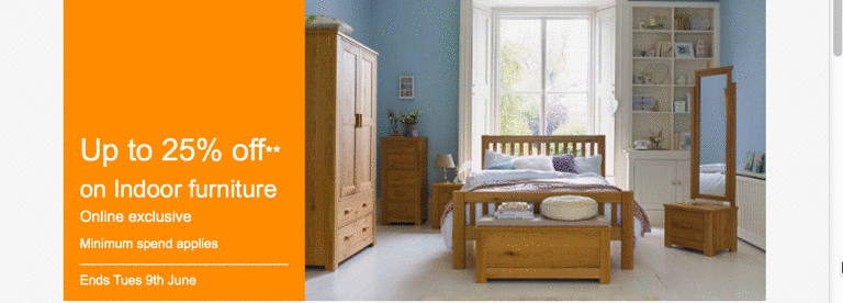
First section
The first section, for want of a better term, features a split of content; 1/3 is a plain orange background with text on it, 2/3 is taken up by a large image relating to the text. I think this is a very appealing way of displaying this content, and having the text aligned to the bottom of the image is a nice touch. On mobile devices it simply stacks the image under the text.
Splitter
I’m giving the splitter it’s own section, as it’s featured a few times in this email. I like the way they’ve done this. The arrow pointing down encouraging you to read further, the subtle coloured background and the text describes what’s below. Nicely done.

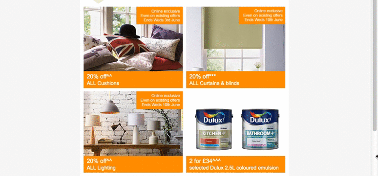
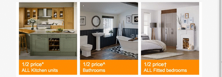
The grid
I’m calling this section the grid. It features a 2×2 grid of products that follow a nice format of having an image of the product with a description underneath. Once again using the nice Homebase orange (orange is my favourite colour!) to bring out the descriptions and highlight key info.
On mobile devices it simply stacks smoothly into a single column layout.
Three column section
Again, I’m not being very creative with the names here! I adore this section, simply because of the way it works on mobile devices. On desktop it’s a three column version, which most people would be stacking into a one column layout on mobiles. Not this email though, no, they simply cut up the images and make it into a smaller three column version, which I think looks fantastic!
Offer section
This area is simply a text offer section that slides gracefully into a mobile version. Nothing spectacular here, just a simple, appealing design.

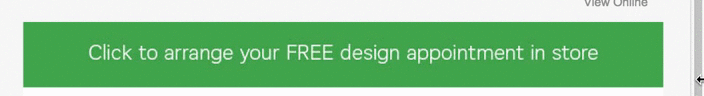
Click to arrange
This little section puzzles me a little bit, just a small thing with it; it’s an image. All throughout the email they used text as text, rather than images, wonder why they changed here? My only guess is to make the whole section clickable. On mobile, they switch out the image to a smaller version:
Final product
They finish off the main bulk of content by repeating the same content style they used the open the email. The only difference is the colour they used is blue this time, which really stands out against the orange and green of the rest of the email.

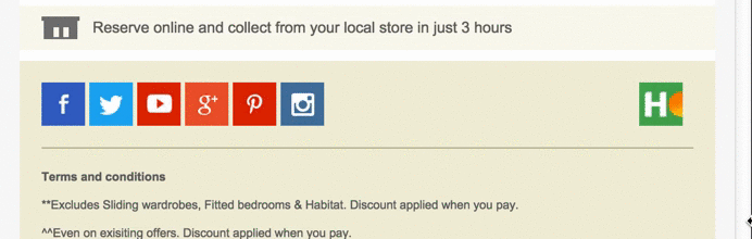
Social and footer
They close out the email with what we regularly see in most emails. Some social buttons and a chunk of terms and conditions text, standard stuff here. Looks good on mobile too!
How it renders across email clients
Now for the big test for all emails; how it renders across different email clients.
If you would like to see how it renders across all different email clients, you can do so here.
Good news, it renders perfectly across all devices. Great job Homebase.
It also looks great on Tablets and Mobile devices. Even supporting older Outlooks such as 2002 and 2003.
Final thoughts
I’m a big fan of this email and don’t actually have any suggestions for improving it? Do you? Let me know in the comments or on Twitter!
I’m a fan of Homebase emails – I really like their clean look and simplicity. They just work, which is what you want out of your email marketing.
Lovely article and analysis.
I will have to strongly disagree with the Three column section though. The image effect here looks great but the text underneath is really bad. Its actually all over the place. So if you are to use this technique please avoid using a lot of text. Its totally anti-aesthetic and goes against all design rules.