Mobile opens are on the rise, and there’s no indication of the trend slowing down. If you read your emails regularly using a smart phone or tablet, you probably know that it’s an experience that can swing from awesome to awful. While an email newsletter can look great in the inbox, when squeezed onto a small screen, it can become absolutely unusable, with small fonts, narrow columns and broken layouts being common issues. We’ve talked before about how important mobile has become to email marketers and the need to optimize campaigns for mobile audiences. So, the question is, how do you make emails more attractive on smartphones? Here are a few quick tips.
Make emails Responsive
Responsive emails have been at the forefront of every email marketer’s mind as industry statistics show that 50 percent of emails are now opened on mobile devices. According to Litmus, “70 percent of brands see their emails opened on mobile” so companies need to keep up with industry trends in order to continually engage with their customers in order to achieve better results on mobile devices.
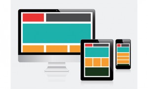
What is responsive design? In a nutshell, it’s design that adapts itself to whatever is being used to view it. A responsive design, in theory, looks as good on a wall-sized super-HDTV as it does on your iPhone, and offers similar functionality. Unlike scalable design which scales 100% table widths down to any screen size, responsive emails allow room for a designer to modify, hide, stack, add or expand/collapse content to optimize usability for narrow screens. While scalable design is certainly easier to code and is likely to “work” on all devices, usability can suffer when layout and design elements are not designed from the smallest screen up.
Design using grids
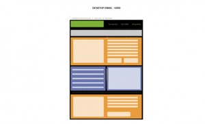
The layout of your emails, the basic structure or framework, if you will – is the grid. Designing to grids is a great way to organise and optimise content for ease of readability. They’re also very effective for the use of clear calls to action and if you’re wanting your email to be responsive. (using a grid means smartphones can adopt a single column of content that is clear and easy to follow).
Design using colour and attractive fonts
Think about the use of colour; make sure that you can read your copy over your background. Using contrasting colours will stand out, will be a pleasant reading experience for your customers and can also be used to emphasise words. Using web fonts that are clear and easy to read like Helvetica, Tahoma and Times New Roman are great choices and ensure that your readers can read your copy by using large font sizes, don’t use anything less than 13px.

Think about what you really want to sell
A theory by Barry Schwartz’ The Paradox of Choice makes the point that the choice isn’t always a good thing and that at some point too many choices is as bad as no choice at all. A responsive email will take its content and stack it for viewing on smartphones which means the emails can get quite lengthy. Having a heap of choices in a standard desktop browser email in itself is never the best idea but what happens when emails that size are viewed on a smartphone? It’s a nightmare of prolonged scrolling simply to reach the bottom! and people generally don’t have the patience nor attention span to scroll through a ton of content they’re maybe not really that interested in. A more attractive smartphone email is to the point and selling maybe only a few products or ideas. It’s all about gaining the readers attention early on and giving them something they’re not going to be confused about.
Include attractive calls to action
Calls to action can be a huge driver for email and getting people to take an action may be the email’s only purpose. A good call to action should be persuasive, compelling, clear and tap-worthy. Building buttons that are able to sit in the center of your smartphone screen and styling them with strong, bold colours will attract attention and gain clicks.
Subject lines: Keep them short, relevant and interesting
Subject lines drive open rates and if they’re more than 60 characters long, customers most likely won’t know about your great offer. The key to subject lines is to keep them catchy and concise, think of them like you would a newspaper heading, if they grab your attention quickly then you’re more likely to read the article.
In short:
– A responsive email viewed on a smartphone is more attractive and increases the over all viewer engagement.
– Designing to grids is a great way to organise content for mobile and for ease of use.
– Contrasting colours, clear and easy to read fonts are a key part of achieving a good smartphone email.
– Think about what you want to sell and don’t over do it with a ton of offers and products.
– Include bold, brightly coloured call to action buttons and or links.
– Lure customers in with interesting, relevant and to the point subject lines.


