

Analysing all your data, whilst massively rewarding with the insights you gain, can be a painful exercise and may leave you feeling like you’re drowning. Spotting trends is a great way to see what is going on with your email marketing – are your opens, clicks and conversions rising / falling, how is your deliverability, which are your best performing campaigns? This can end up being a huge task with potentially gigabytes of data to trawl through, and with platform limitations restricting how far back you can go, your insight may be limited to platform specific timeframes. Since we love to go the extra mile, we developed our own system agnostic reporting suite (hosted online) which pulls data month by month since inception to produce a breakdown of email activity and to allow easy trend spotting which can be customised to include extra information beyond the basics if required.
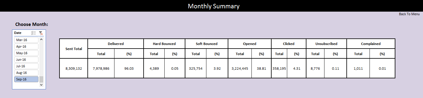
Monthly Summary
You can view how many emails were sent, the delivery rate, HB and SB rates, the number and percentage of openers, clickers, unsubscribes and complaints for each month. The month selector will go back from the first month sending commenced. By clicking back through previous months the figures will update and should give you a really quick idea of rises or falls from one month to the next.
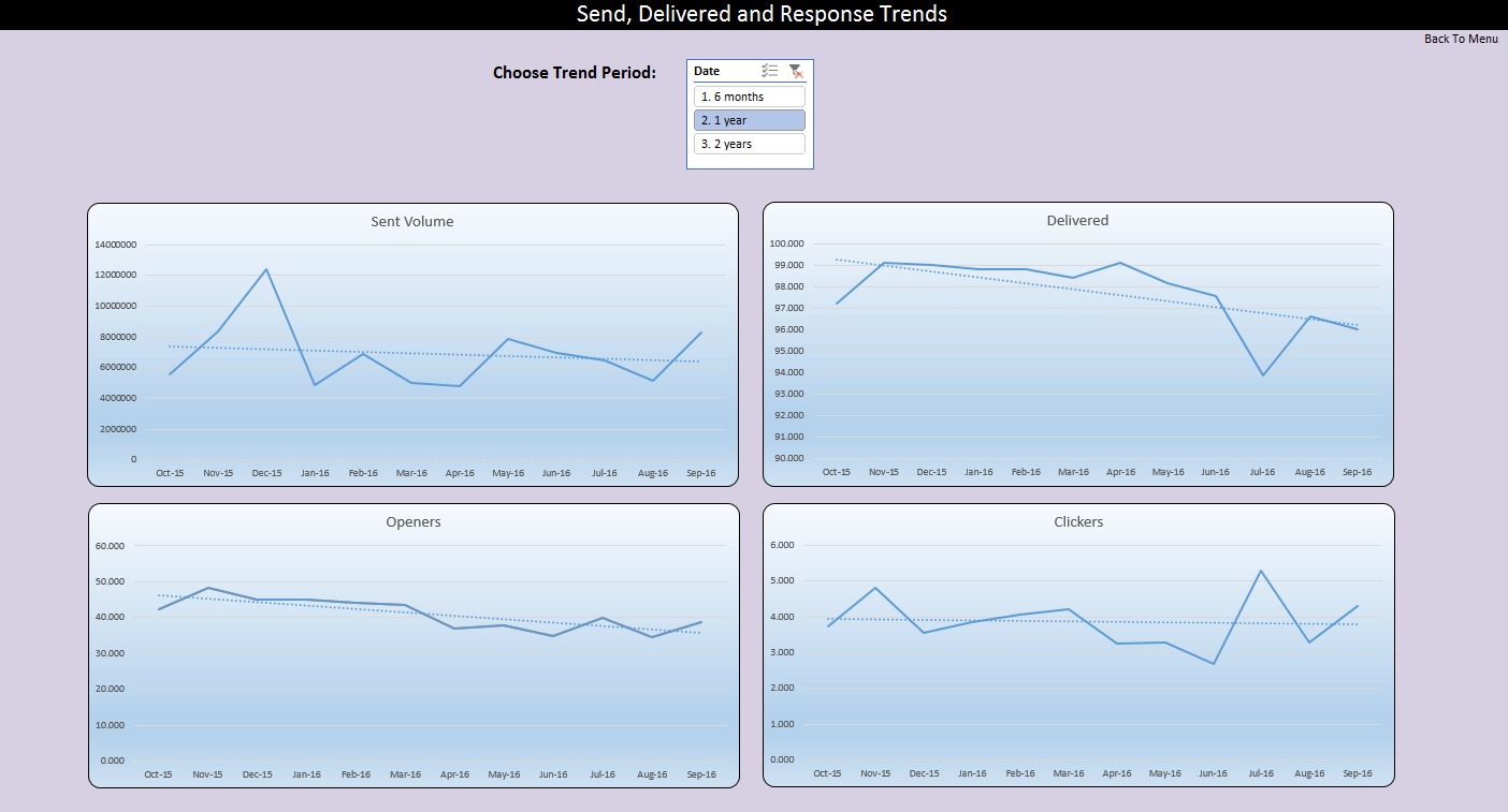
Send, Delivered and Response Trends
The current setup will let you see trends for your sent volumes and your delivered, opened and click percentages over a 6 month, 1-year and 2-year period so you can see both long and short term trends.
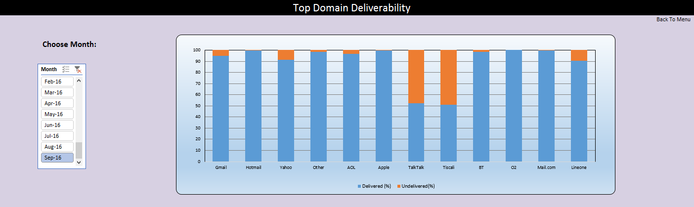
Top Domain Deliverability
If your deliverability does start to slip, the top domain deliverability chart will show the percentage delivered (in blue) of top domains that make up your data and so where there is orange there is a delivery issue which should allow you to instantly see which domains you are struggling to send to and help you investigate the problem further.
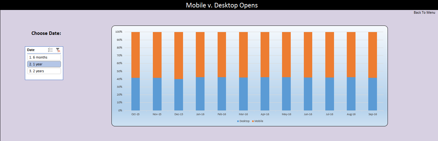
Mobile v. Desktop Opens
The Mobile V. Desktop Opens chart will allow you to see what devices your users are most likely to use to open your emails, and also whether they are increasing / decreasing in the short and long term. Blue covers all desktop devices and webmail accessed via a desktop browser and orange represents all mobile devices from smartphones to tablets. This can be important when deciding how to design your emails especially when it comes to making them responsive.
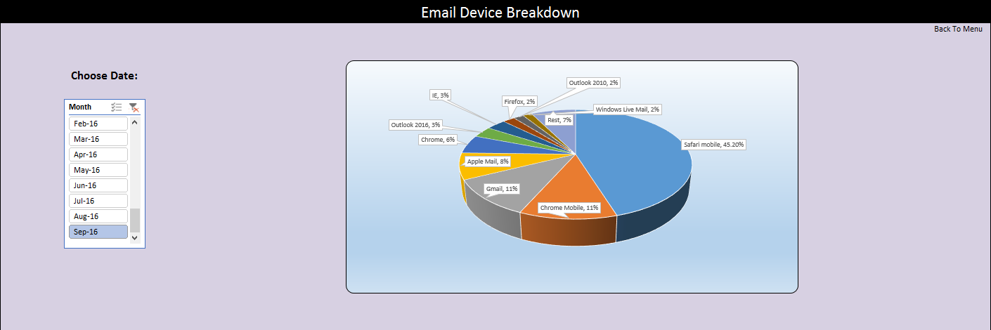
Email Device Breakdown
The device type can be broken down further into browser and app information so you can see which email clients are most important to design for. Obviously, the ideal would be for an email to render perfectly everywhere, but for some configurations it just isn’t possible and there is no point busting a gut trying to fix emails for the lowest common denominator. This breakdown should enable designers to concentrate on the most important browsers and apps.
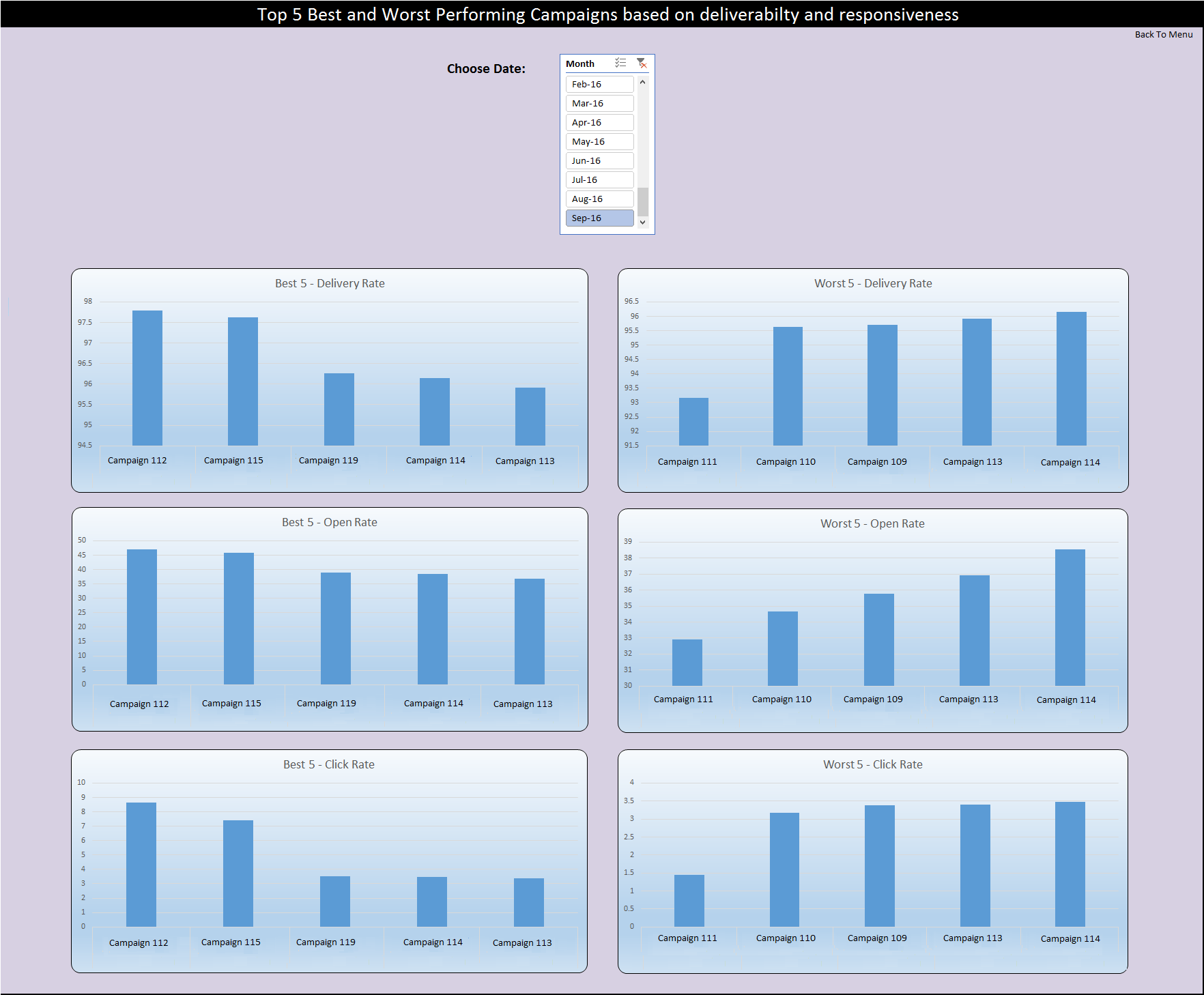
Top 5 Best and Worst Performing Campaigns based on deliverability and responsiveness
You can see at a quick glance which were your top 5 best and worst performing campaigns based upon deliverability, opens and clicks which should allow you to make strategic marketing decisions and to learn what works and what doesn’t work in your current setup.
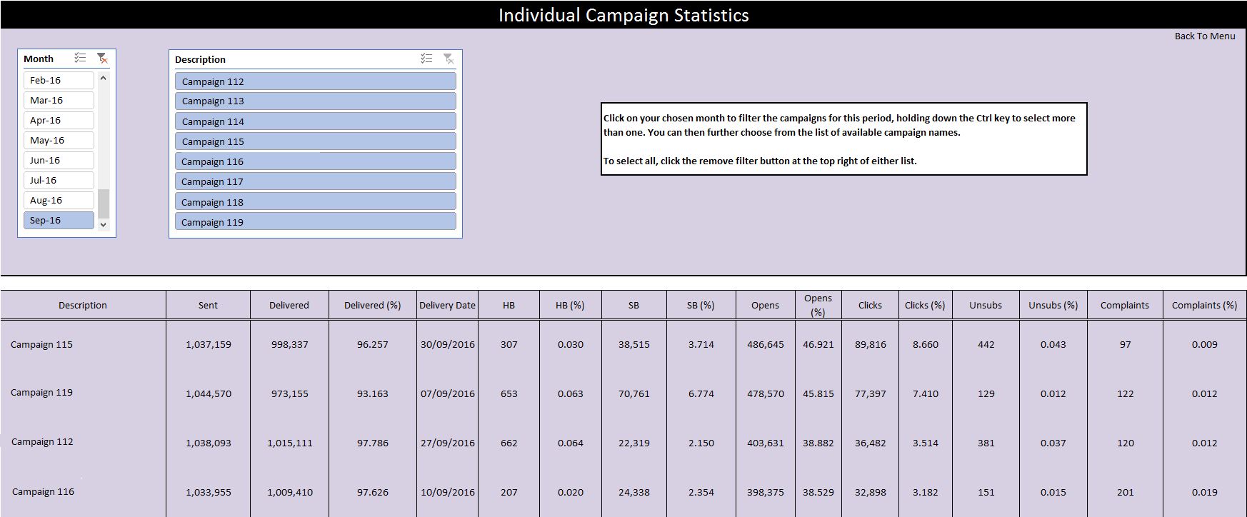
Individual Campaign Statistics
Finally, you can see all the campaigns that went out in any given month and select just the ones you want to look at for comparison. You can also include multiple months at the same time to widen the comparison search.
Custom Reporting
If ever there is the need to keep track of other information these can easily be included in the monthly report, for example (to name but a few):
- Preference Centres – trending the percentage of those that select a preference over those that unsubscribe plus a breakdown of what those chosen preferences are.
- Automated Trigger Programmes – if you have ongoing programmes, e.g. a welcome programme or a reactivation programme any stats you require can also be recorded month on month for comparison.
- Conversions – if you opt for conversion tracking on a retail site these can be recorded and used to check the revenue generated month on month.
These monthly breakdown reports are designed to show up obvious trends, be they positive or negative, to highlight quickly and easily where there may be a problem or what is working and what isn’t, all to add insight for when formulating your marketing, design and content strategies. They are also the first stepping stone for investigation into the performance of your campaigns to give you an idea of what threads to follow. They are built with flexibility in mind, so if you want something added all you would have to do is ask.