
Welcome to the latest instalment of my email analysis series!
For this week’s review, I’ve picked out an email which landed in my inbox from the outdoor gear shop, REI.
You can see the full email here.
First Impressions
My first impressions of this email were mixed. Overall, I liked the look and feel of the email. The design suits their brand well. However, I spotted a lot of things that were a cause for concern, such as it being rather image heavy and featuring a very busy navigation bar.
Layer by layer email analysis
Now let’s break the email down section by section.
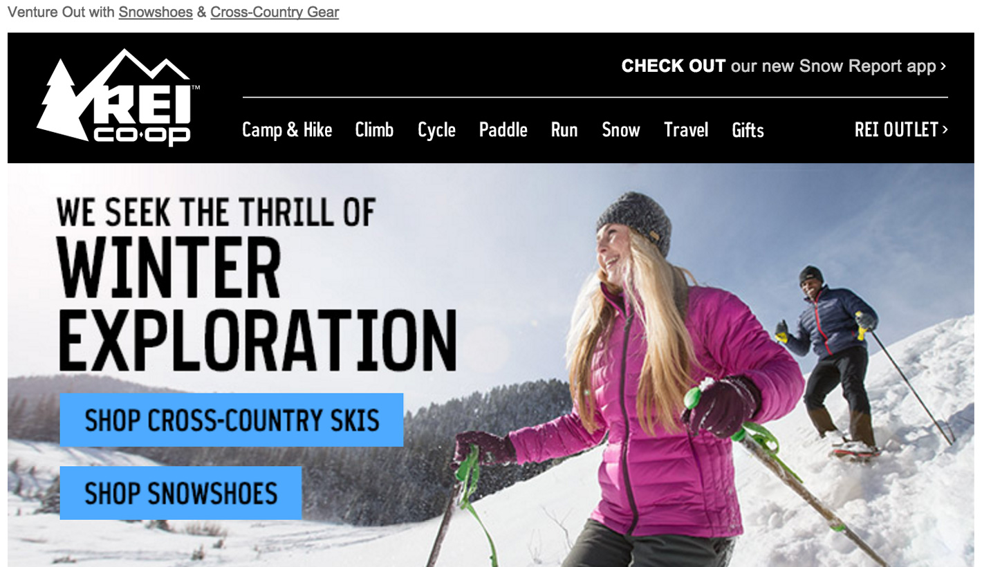
Header
The email starts fairly standard manner with the header. The header features all of the usual elements; a preheader and a logo.
It’s then followed by a very “busy” section, a navigation bar with 10 different links and an extra link to their app. It’s always a hot debate whether navigation bars belong in email, I personally haven’t decided which side of the fence I sit on yet (very boring, I know!) but I do know that this one works incredibly well on mobile.

It’s a great bit of coding to hide the entire navigation on desktop and pull in a mobile hamburger menu. Again, whether hamburger menus are good UX is a debate for another day. What we can do is appreciate this fine bit of development work.
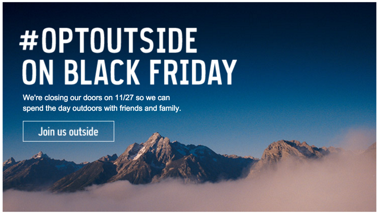
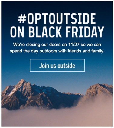
Hero Section
Next up is the hero section. This section features a nice emotive image with two buttons and a title, fairly standard stuff. Again, though, we can appreciate some fine mobile coding on this section.
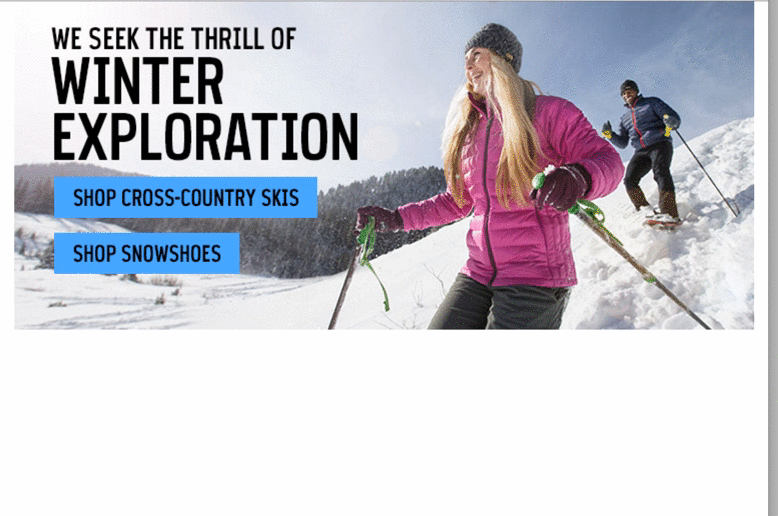
As you can see from the GIF above, the left hand side of the image changes to match the stacking, including the title turning from black to white. The Buttons stack nicely and change the background image behind them, and the people skiing stacks too.
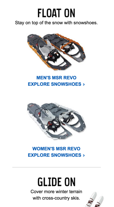
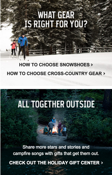
Product Section
Next up is a fairly standard two column section.
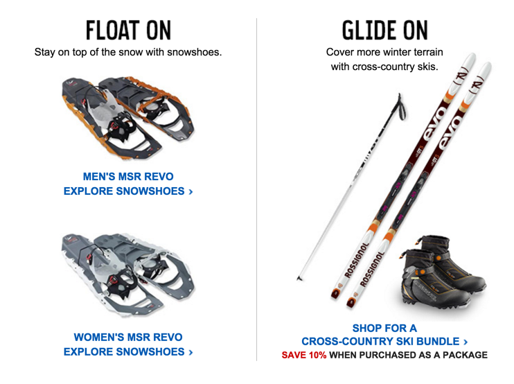
Although it’s a normal section we see in a lot of emails it does look good here. The two products on the left perfectly match up with the right hand product. The titles keep their branding consistent across the email and the CTAs stand out well.
When it comes to the mobile version, it simply stacks neatly into one column.
Approved for adventure
The next section continues the great coding work we’ve seen in this email so far.
It’s a product section with two products set onto a background image. By using bulletproof backgrounds, they’ve been able to get actual text rather than just images on this section.
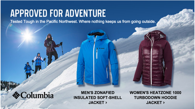
Whoever has coded this email clearly knows what they’re doing. Rather than messing around with the bulletproof backgrounds and content inside it to try and get it to respond perfectly, they’ve opted to just hide the entire section and pull in a fresh mobile version as seen below.
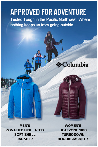
Not bad!
Two column adverts
Another fairly standard section we see in a lot of emails; the classic two column advert. This section featuring two columns, each with their own separate little image and CTA text.
Again, the use of bulletproof background images allow them to pull in real text rather than images, making a much better experience for the subscriber.
On mobile they simply stack into one column.
Bottom hero
Coming to the last section of actual content we find ourselves looking at a hero section at the bottom.
I’m starting to sound like a broken record, but they’ve done a really good job using bulletproof backgrounds to allow the use of actual text. What they do for the mobile version here, again, is very clever. They simply hide the right part of the hero, allowing it to stack into a one column, and switch out the header for a more mobile friendly one. Very well done!
Footer
The footer – where do I even get started? There is so much going on in this footer. First off we have social links, followed by a lot of different links to different areas such as their app, membership program, etc. That’s then followed by some satisfaction guarantees and finally the unsubscribe links and general terms & conditions.
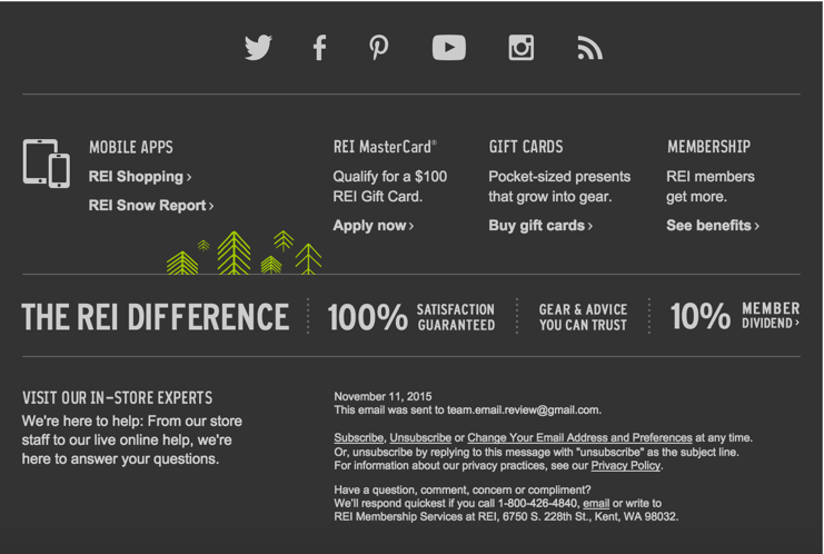
When it comes to mobile, we have to start all over again! The footer changes entirely for mobile devices.
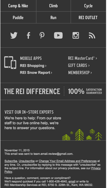
The first thing you’ll notice is they’re pulling in a mobile navigation to sit at the bottom. I’m actually not a fan of this, but can appreciate why they do it. They keep all of their social links in the same place which do look good on mobile. That’s then followed by the link section I mentioned above, only they’ve removed all of the description and simply left the CTAs. Finally, again, that’s followed by the unsubscribe links and general terms & conditions.
How it renders across email clients
Now for the big test for all emails; how it renders across different email clients.
If you would like to see how it renders across all different email clients, you can do so here.
The good news that it seems to render well across all the usual suspects.
It also looks great on tablets and mobile devices, even supporting older Outlooks such as 2002 and 2003, and the new Outlook beast; 2016.
Final thoughts
This email was definitely interesting to review and I feel it may be a fairly controversial one with the people reading this post. There are a lot of “love it or hate it” parts of the email. Especially such heavy information flooded header and footers.
What I can appreciate about this email was the high quality of coding that went into it. Although it’s up for debate whether switching out entire sections is wise for mobile optimisation (you create twice as much work, twice as much code bloat, twice as much loading time) the way they have done it is excellent.
I’ll be keeping an eye on my inbox and seeing if the next REI email features as many flashy tricks, that’s for sure!
I’d love to hear what you think of this email though!
If you have any thoughts on this email, let me know in the comments or on Twitter!
Another great review Alex! I’ve been a big fan of REI’s emails for a long time. Although their designs have always been a little busy for me I’ve always appreciated how they code their emails.
First time I’ve noticed text being over lay on top of images using bulletproof backgrounds. I’ve always just assumed it’s an image with text not actual text. I’ll have to keep an eye out for other examples of bulletproof backgrounds in use.
REI emails are brilliantly made. Definitely a fan of them. Even with that nav bar! Kind of feel like their nav gets a little lost though. Everything in the header is black/white and it looks great, but if you’re wanting to draw click-throughs with your CTA, I would have thought they’d want to make more of it. Use of the hamburger menu gets me conflicted. Yes, it’s great use of a technique, but I’d like to see the stats on hamburger vs. normal nav.
Also, why have the nav repeated in the footer for mobile? Feels like duplicated content for no reason. Maybe. I dunno how it all performs!
Great review, Alex! Any chance you can post the source code for this one as well as for the previous reviews you’ve done?
Being able to look at the source code really helps to learn and understand the different techniques that email designers are using