

Welcome to the fifth instalment of my email analysis series!
For this week’s review, I’ve picked out an email which landed in my inbox from the world famous Campbell Soup.
You can see the full email here.
First Impressions
My first impressions of this email were very positive. I’m a big fan of the very understated design, using colours fantastically well to emphasise different areas of the email. I also love how they have used colours to clearly define different sections of the email. It also gets bonus points for being mobile optimised, adapting well to smaller devices.
Layer by layer email analysis
Now let’s break the email down section by section.
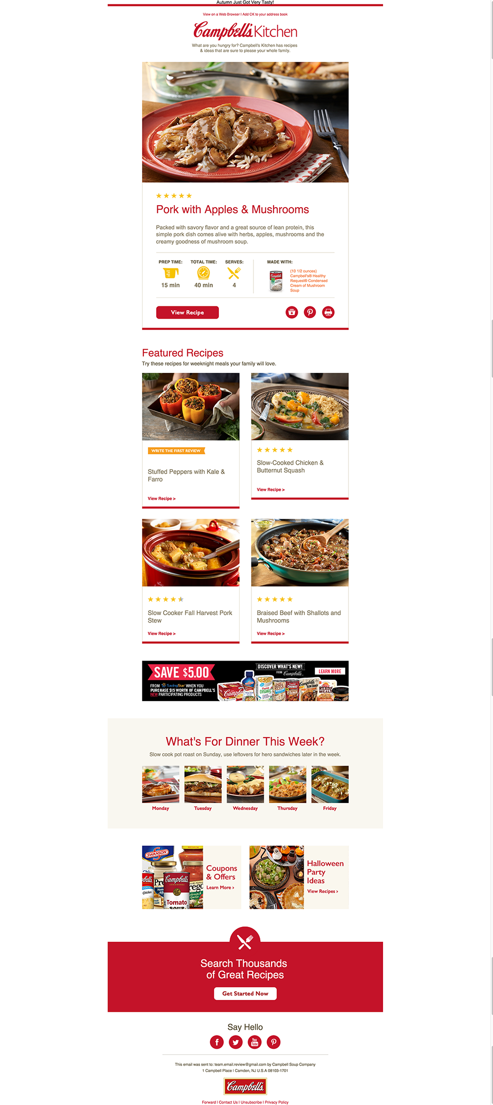
Header
The email starts fairly standardly with the header. The header features all of the usual elements; a preheader, a logo and a view in browser link. The only thing slightly off here is it looks like the preheader is meant to be hidden but is actually showing. It looks a little off, but it’s a simple fix for this.
Recipe section
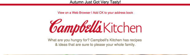
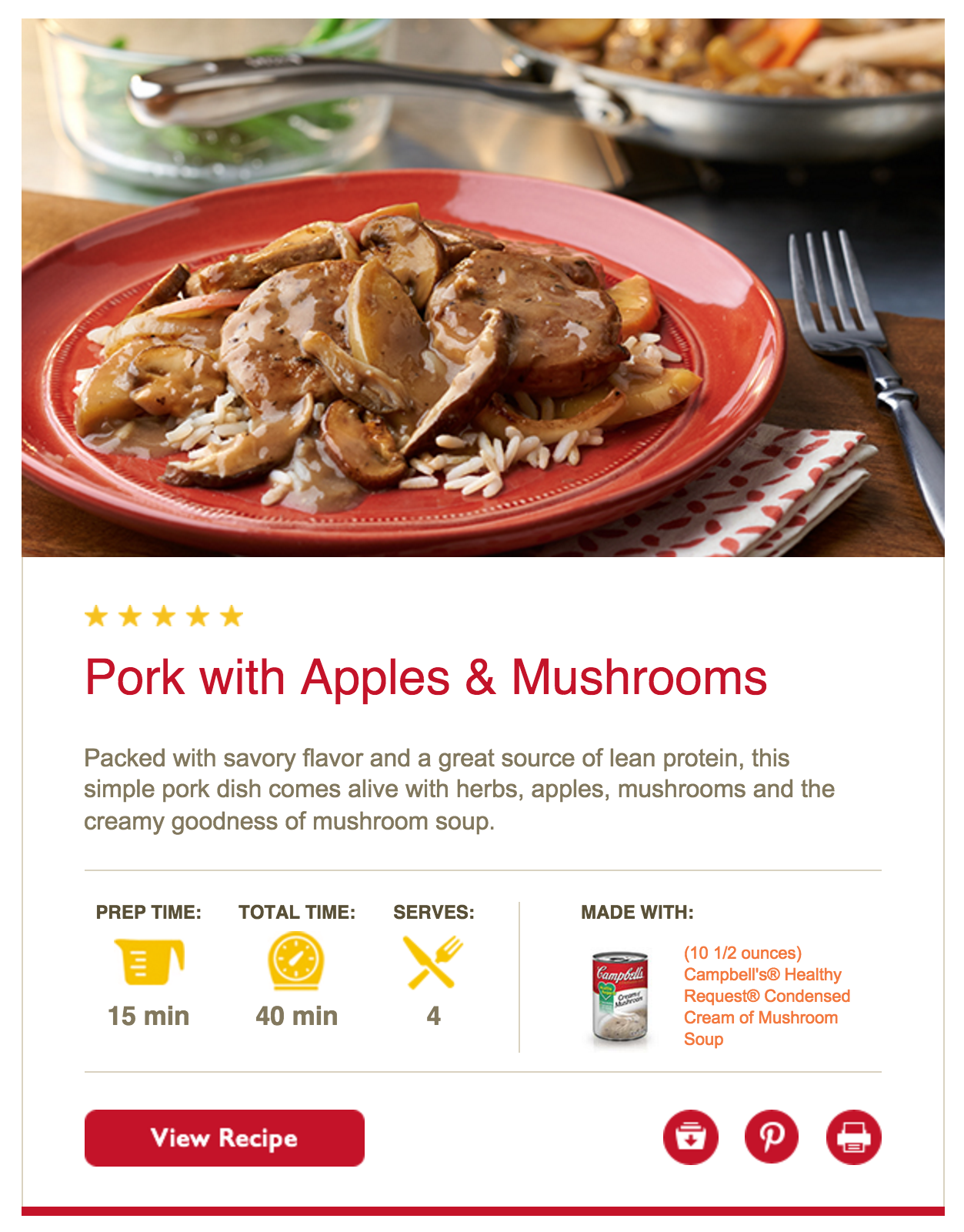
Next up we have the first real bit of content; a large recipe section.
You can see the full section here.
I absolutely love how this section is designed. As I mentioned in the first impressions they use colour in a very nice way. This section is clearly boxed off so you can tell it apart from the rest of the email too which is really nice. The section starts with a large image of the food you’ll be making which not only looks nice, but inspires the reader to actually make the recipe.
Following that is key information about the recipe; the name, description, rating, timings and servings, the ingredients, a nice large red CTA to view the recipe and some extra links.
The only suggestion I have for this section is that the CTA could be done as a bulletproof button, rather than just as an image.
Not only is this section nicely designed, it optimises well for smaller devices too.
Featured Recipes
The next section features four extra recipes in a different layout from the recipe above. They have this in a 2×2 box setup.
The first thing you notice when viewing this section is that the first row of the 2×2 setup don’t actually line up because one of the recipes doesn’t have any ratings yet.
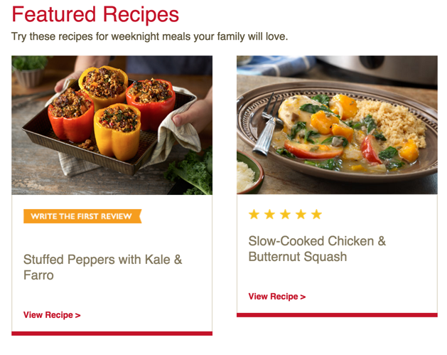
This is a real shame because not only does it take away from the lovely design (I really love the red accents under the boxes) it’s also a really simple fix.
Luckily, the second row does line up.
As for the boxes themselves, they feature a fairly simple yet effective design. Each box is bordered off to separate them. They have the really nice red accents I mentioned above and also follow the first recipes trend of having really nice emotive imagery. In these boxes the CTAs are actually text too – yay!
When it comes to mobile optimisation they do the expected thing and stack nicely into a one column format.
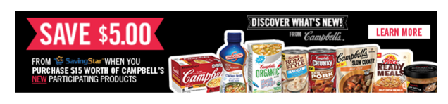
Advert
The next section is barely worth mentioning but I’m adding it in just so we have the whole email covered. It’s simply a full width image advert that scales on mobile.
Call out box
Next up is another section that’s separated off. This time with a coloured background rather than a border.
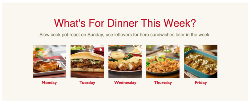
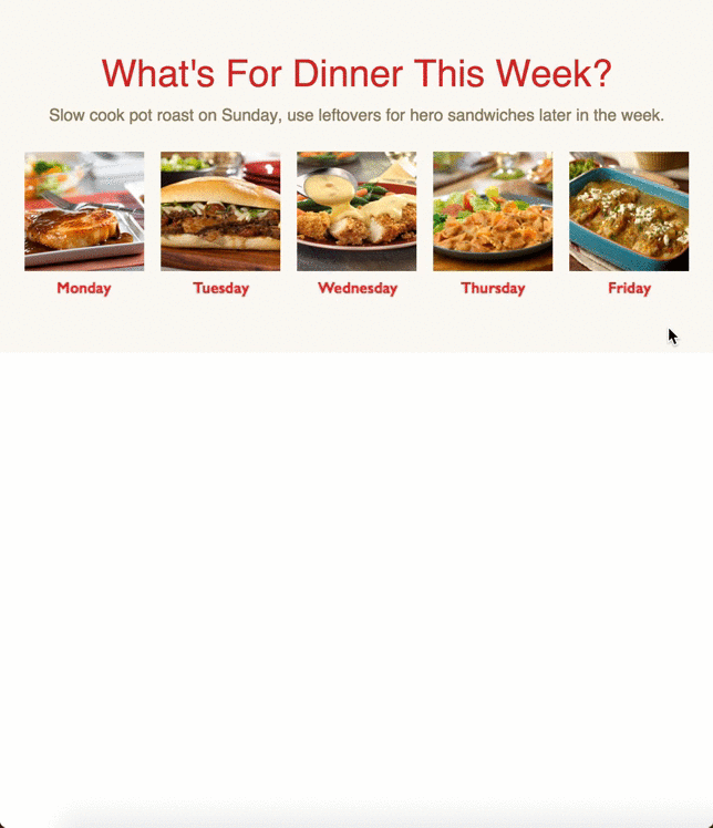
This section kicks off with a nice large red header reading “What’s for dinner this week?” followed by some smaller follow up text. I really like this header, it propositions the reader and really got me to stop and read the box.
Under that is an image for each day and a caption of the day. The only odd thing here is that the captions are in images rather than text, again this is a really easy fix but it’s not the end of the world. It does seem a bit weird, seeing as the title and description are in text rather than images.
On smaller devices this section transitions from a 5 column setup to a 2-2-1, probably the most simple solution but very effective.
Two column
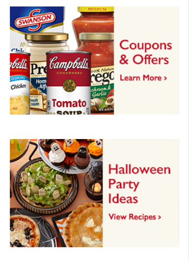
The next section is a fairly standard two column section. As seems to be a bit of a fashion with parts of this email, they have opted to go with an image rather than text.
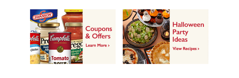
An odd thing with this section is that the image to text (or fake text, if you will) is different in each column. This is clearly because the right box features the world Halloween, forcing it out. Regardless, this could be a simple fix.
When it switches to a mobile version the two column version stacks, making the differing image to text ratio even more evident.
Call out box two
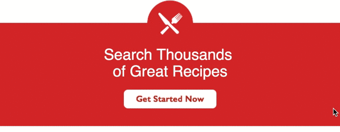
Next up we have another call out box. This time using a solid red background to pull it out from the rest of the email.

Although this section is fairly simple I absolutely love how it looks. It really stands out from the rest of the email and works nicely as a call-to-action.
The top of the email has a clever little half circle with a nice icon for the recipes followed up by a nice big header telling you exactly what you’ll get.
My only gripe, which seems to be a fairly common occurrence in this email, is that the actual CTA button is an image rather than a bulletproof button.
On mobile devices it scales down nicely too.
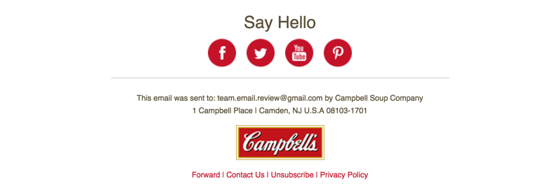
Footer
With the footer we reach the end of this email. They don’t do anything out of the ordinary for their footer, it’s simply some social sharing links followed by contact information and the usual unsubscribe links and similar.
How it renders across email clients
Now for the big test for all emails; how it renders across different email clients.
If you would like to see how it renders across all different email clients, you can do so here.
The good news that it seems to render well across all the usual suspects.
It also looks great on tablets and mobile devices, even supporting older Outlooks such as 2002 and 2003, and the new Outlook beast; 2016.
Final thoughts
Although a few corners have been cut in this email which I’ve pointed out (mainly the use of images over text) and a couple of other changes, this email as a whole is one I definitely enjoyed receiving. The use of emotive imagery and good use of colour to call out different sections made the design pleasant as well as function.
I’d love to hear what you think of this email though!
If you have any thoughts on this email, let me know in the comments or on Twitter!