
So here at display block we’ve taken the time to do a user experience piece by @mikepickn on the new Outlook for iOS. @omgitsonlyalex has also looked at it from a technical perspective here.
I have taken a few days to use and get to know Outlook for iOS and I am glad I have. When I first downloaded it I had the real feeling that it was a solution for a problem that didn’t exist. iOS had it’s own tool, mail that was indigenous to the product and built on the iOS system. It was a tool fit for purpose. This was further compounded when I tried to set up my work email account and having never used an Exchange account before, I’ve been Apple for longer than I can remember, I wasn’t aware that my server settings needed to change to a mobilsync. server on rackspace. I was embarrassed to say I had to seek technical help! However, once that was set up and I started to use Outlook on iOS I was pleasantly surprised.
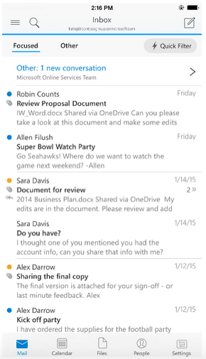
Let’s start with email itself, the email experience is very like gmails primary and promotions tabs, but in this iteration of outlook they are called Focused and Other and it would appear from 4 or 5 days use that two things are happening: Firstly, Outlook appears to be getting the categorisation right in most cases and secondly, it appears to be learning from my browsing habits. The search functionality also seems quick and very accurate, I did a search for someone I knew I hadn’t had an email from since 2007 and it found the conversation within 4-5 seconds which impressed me no end. I have had terrible trouble finding older conversations on the pre-installed apple mail, unless the conversation is still on the phone it can be very hit and miss. I have been infuriated with the amount of times I have stood with someone looking for the same conversation and they have found it quicker on their “inferior” smart phones. It would appear Outlook for iOS puts me back in that particular game. The swipe functionality which exists here as well as most other apps on iOS means there is a consistency of user experience not often associated with Outlook products crossing the divide.
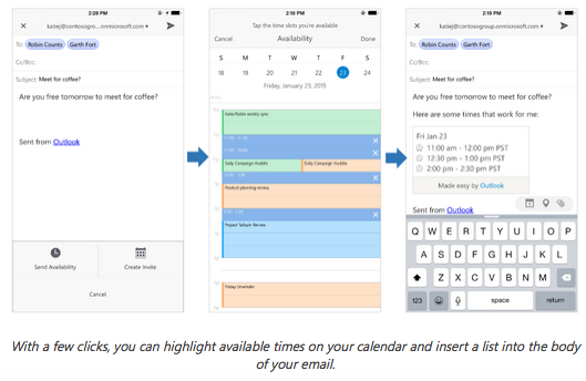
The Calendar, which is integrated into the app is really cool, allowing you to Accept/Tentative/Decline via it’s “Quick RSVP” feature straight from the client without the need to open the email. The other feature I really like is the send availability, allowing you to “suggest” a few available dates right within the app and then create the meeting invitation without ever leaving the app.
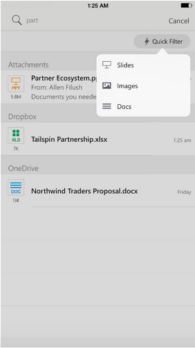
The files section seems to be a great way to manage any incoming files, open documents and move them onto one drive or dropbox, it is all very intuitive and easy to handle. It breaks your recent files received down by today, yesterday, last week, last month and then their is a search function for older files. There is also a quick filter tab which enables you to filter only file types that you have received that match your criteria, i.e. images, or docs or slides. Which improves and speeds up the search process.
When you set up your account it also automatically pulls in your contacts and they auto populate when using the email function or under the people tab there is a list of them to select from. All in all I am impressed enough with Outlook for iOS that I am switching over to it permanently, or at least until a better shinier toy comes out for me to play with.