Image blocking has always been a challenge for email marketers. Some email clients hide images by default, leaving your beautifully crafted newsletter as little more than a few stray alt tags scattered around in white space.
So how do you make sure your emails look presentable when stripped of their images?
Let’s rule out some ideas which don’t work before we look at those that do.
Embedded images
Adding images to a web page doesn’t necessarily mean linking to an external file. It’s possible to use a data URI instead and paste the image data right there in your HTML document.
There are drag-and-drop online converters which can generate the data for you. Just feed them an image and they’ll return a string of base64 code, ready to drop into your image src.
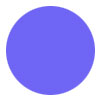
Take this simple circle for example:
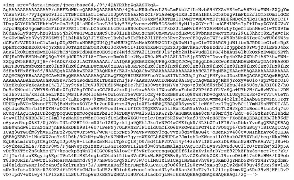
It can be generated with this code:
Let’s try something more complex. At 500 pixels wide, the display block logo weighs in at nearly 25KB. Considering the 100KB limit for email HTML, that’s a big chunk spent on one image.
Our theory was that the inclusion of image data directly inside the HTML file rather than hosted on a server somewhere could trick email clients into displaying graphics automatically. That would have been worth some extra code here and there if managed carefully. Unfortunately, we were hoping for too much – testing reveals that embedded images are blocked just like any other.
To top things off, embedded images fail to render in several email clients and spam filters might not like their presence.
VERDICT: Avoid at all costs. There are zero advantages to embedding images in email.
Scalable Vector Graphics
Next up is the use of vector graphics. The SVG format is well supported on the web and offers some great benefits such as small file size and being zoom-able without turning into a pixellated smudge.
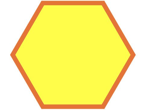
While SVG images can be standalone files, what we’re interested in is the ability to draw them using inline HTML code. Here’s the code for a hexagon:
<svg height=”366″ width=”420″>
<polygon points=”110,10 310,10 410,183 310,356 110,356 10,183″ style=”fill:#fffd4a;stroke:#e47437;stroke-width:15;”/>
</svg>
And here’s how it looks when rendered:
No img tag, nothing to be downloaded from a server and no heaps of indecipherable base64 code. If only it worked. While some email clients do support SVG using other methods, the inline HTML method is only likely to work in email clients where images aren’t blocked.
It’s also possible to insert an SVG image as an object with a data URI, similar to our attempts with embedded images earlier. As you’d expect, that technique is also doomed to failure.
VERDICT: It doesn’t work. Support is missing in the email clients which could benefit most from it.
Mosaics
Our previous attempts to smuggle images past image blocking have failed, so let’s take a new approach. Slicing images is common practice in web and email development. We’re going to take slicing to the extreme and divide a photograph into a full grid. We’ll place each slice into a separate table cell in our HTML file and apply a background colour based on its slice.
What we’re hoping to achieve is an impression of the original photograph which will be visible when images are turned off. The result is going to be blocky, but it’ll surely be a lot more visually striking than one big placeholder image with an alt tag.
Don’t worry, we’re not planning on figuring out the colours and coding all of this by hand. There’s an image-to-table converter which can do a lot of the work for us: https://codepen.io/johndjameson/details/qcaAm
Here’s the image which we’d like to convert:
We want to display it at a width of 600 pixels in our email. In order to be Retina-friendly, the source image is double that. To simplify the maths, I’ve temporarily resized it to 600 pixels in Photoshop.
Next step is to apply a Pixelate > Mosaic filter and adjust the size until the squares are at their largest while the photo’s subject remains recognisable. 15 pixels looks reasonable:
600 divided by 15 is 40, so that’s how many vertical slices we need. The height divides into 28 slices. 40 multiplied by 28 comes to 1,120. That means 1,120 individual image slices and this is where the plan starts to fall apart.
For the images alone, we’d need around 100KB of code and we’ve not even built the table structure yet. In other words, our HTML file would massively exceed the 100KB spam limit.
Let’s be smarter about our mosaic. We don’t actually need a precise grid. Instead we can manually divide the image into its most significant blocks of colour. That lets us cut out slices of varying widths and dramatically reduces the number of individual images required.
Since this needs to be a manual process, it’s a laborious (albeit strangely satisfying) task. The result might look like a relic from the 8-bit era but we’ve succeeded in giving a general impression of the original image and it needs only a streamlined 10KB of HTML code, tables and all.
It works pretty well in the email clients most likely to block images – currently Outlook, Outlook.com and Yahoo! Mail. Here’s how it looks in in Yahoo! for example:
Now for the bad news. Scaling this volume of slices to fit different screen sizes yields some unintended results when images are active:
This happens in major email clients and devices to varying degrees and that makes it too significant a hitch to ignore. The last thing we want to do is break the full version of our email in favour of a neat trick.
VERDICT: A nice idea which has some limited potential but fails to achieve our goals in this experiment.
All of the failed approaches above have one thing in common – they are attempts to cheat our way around image blocking. Your customer might have a legitimate reason to hide images so, in retrospect, these attempts could be considered as spam tactics. Good thing they don’t work.
Now for the fun part. The following methods will make sure your emails look great even when images are off.
Styled alt text
Alt tags are important for accessibility and to let people know what your email is about if it arrives with images blocked. By default they look plain and uncompelling.
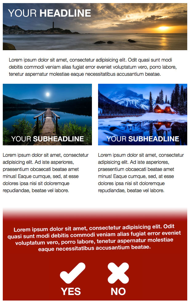
Take this mock-up email for example:
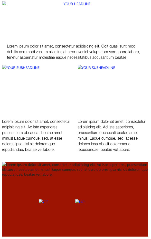
This is how ugly it looks with images off:
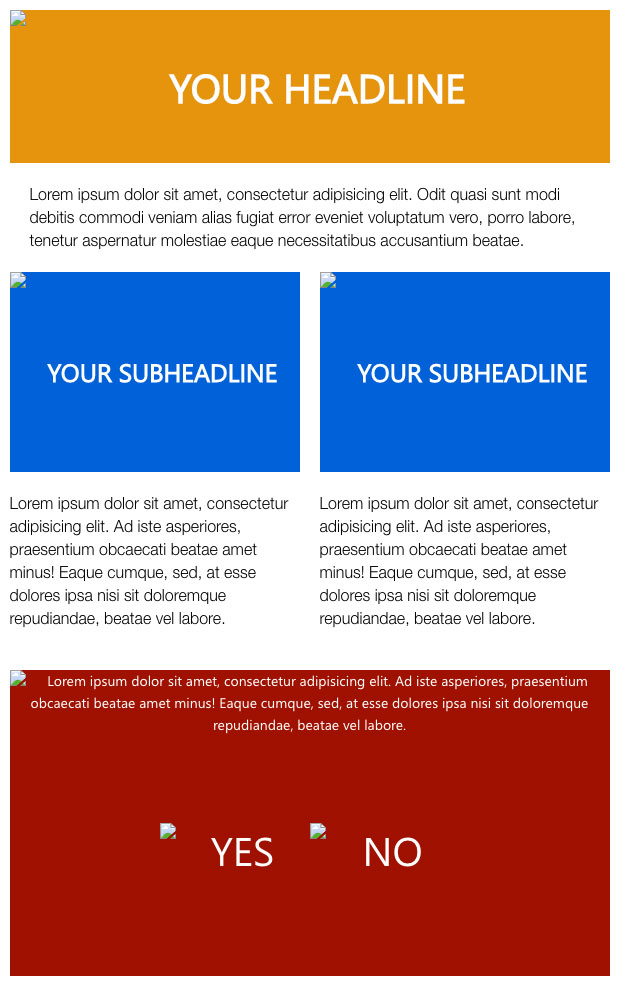
Making it look presentable couldn’t be simpler. We only need to apply a few basic CSS styles to the image and we can control the font family, colour and size just like any other text in our document. We also recommend experimenting with line-height to control the text’s vertical position. Couple that with background colours and text alignment on the table cells and you’ll find that the image-blocked email suddenly looks a lot more presentable:
In addition to the improvement from a design perspective, styled alt tags can make your copy more legible. Just look at the before and after screenshots for the red part of our template.
I’ll admit it – I’ve been lazy in the past when it come to prettifying alt tags. When rushing to meet deadlines it seems like an expendable step. Looking at the screenshots above serves as a reminder that it is not. Incorporate styled alt tags into your templates or set up code snippets and it’ll quickly become an integral part of your development process.
Support, as always, depends on the email client and browser but it’s generally decent. No hacks or fallbacks are needed – this is just simple inline code and can be thought of as best practice for email development.
VERDICT: Do it. It’s easy, effective and the code is minimal.
Web fonts
Traditionally we’ve been forced to pick one of two options when it comes to writing copy in email. We could either follow best practice by using actual text based on a handful of uninspiring desktop fonts or ignore best practice and resort to an image instead.
The introduction of web fonts changes that. By linking to a hosted font, whether it’s stored on your own server or at the convenient Google Fonts, you can display it on the user’s device. If their email client doesn’t support it, it’ll pick the next compatible typeface in your font stack. Outlook needs a little more attention or it’ll default to Times New Roman but there’s a simple fix for that. Have a look at this guide to web fonts at Litmus for the technical info.
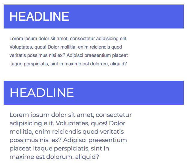
With a world of fonts at your disposal, your typography options are vast. You can even keep your marketing department happy by sticking to brand approved fonts at all times. Here’s a comparison of desktop versus web fonts:
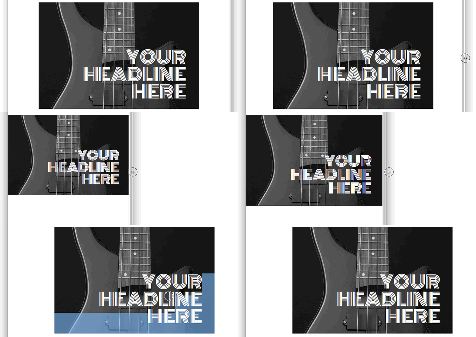
If you’re feeling adventurous, you could even try overlaying a web font on a background image. This lets you incorporate actual text into key elements of your design such as the hero image. Here’s an example:
There are a few key points to note.
- It uses the Outlook background hack. Check out Campaign Monitor’s bulletproof backgrounds service if you’re unfamiliar.
- There are a couple of transparent spacer GIFs which force the text into place and keep the image in proportion when it’s scaled down.
- We switch the font-size and line-height units to viewport widths (vw) on mobile to make sure the text scales to match the image behind it.
- There’s a dark background colour to ensure the white text is visible when images are off.
Web fonts are currently supported in the places you’d expect – iPad, iPhone, Apple Mail, Samsung, Android native – and a couple more. Gmail and webmail will show your backup fonts for now.
VERDICT: This ought to be standard practice. Support is good and it’s easy to set up fallback fonts.
CSS3 styling
CSS is equipped with all sorts of features to bring HTML to life. The basics such as padding, fonts, colours and borders are all supported, at least partially, even in Outlook.
But that’s just the tip of the iceberg. CSS is capable of so much more and that invites us to experiment.
Here’s a simple table with some text:
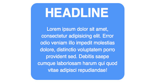
Let’s round the corners by using the border-radius property:
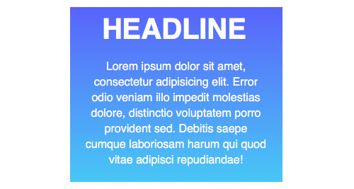
Gradients may be out of fashion but we’re going to go ahead and apply one anyway. We can use background-image: linear-gradient to achieve that:
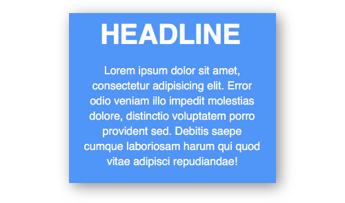
How about a drop shadow instead? Applying box-shadow to the table lets us create the illusion of depth:
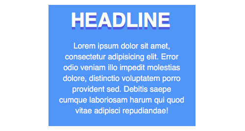
Alternatively, we can apply some CSS to the text itself. Here’s how the header might look with text-shadow applied:
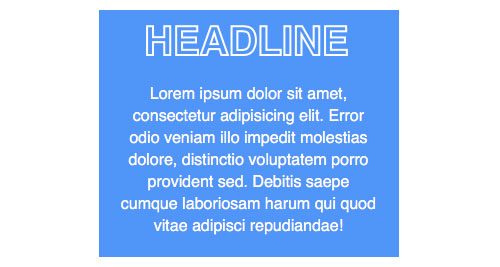
And here’s how it looks with an outline formed using -webkit-text-stroke and -webkit-text-fill-color:
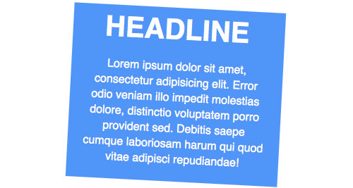
If we really want to draw attention to a particular part of an email, we could apply a transform effect such as rotation:
Or even add some motion with a simple keyframe animation:
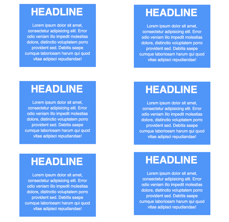
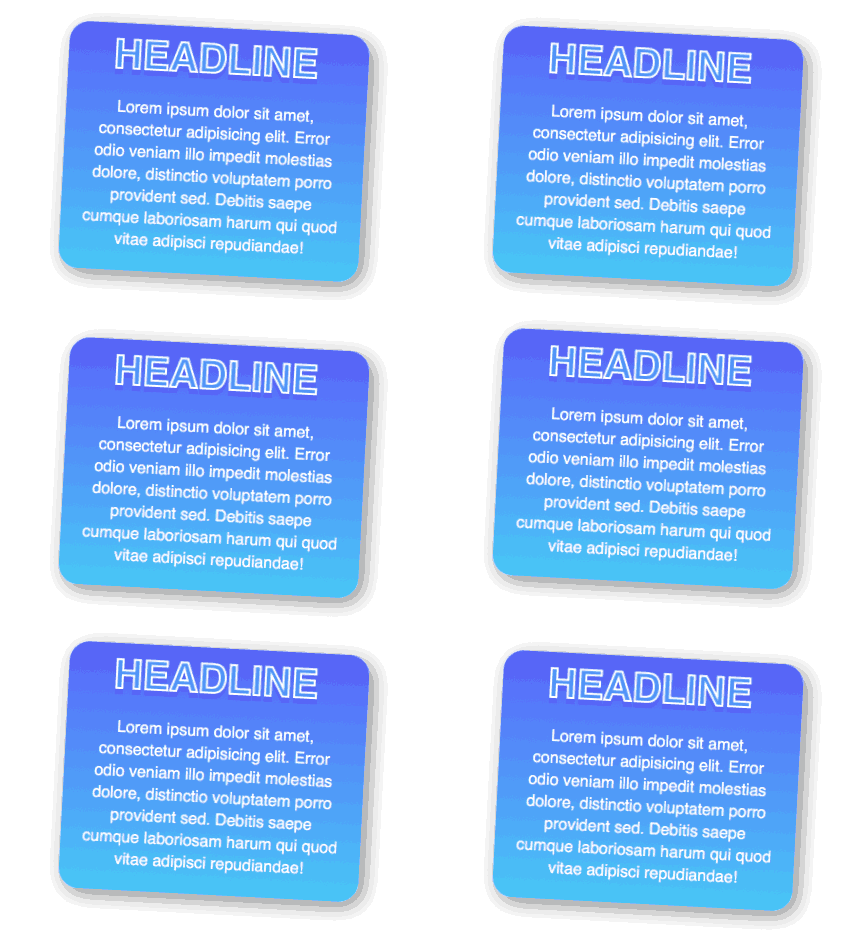
We can apply as many of these techniques as we like. This example might be a little over-the-top but it illustrates what can be achieved without images by combining CSS effects:
Support for these techniques is surprisingly good. They work perfectly on iPhone, iPad, Apple Mail, Android native and Samsung’s email app. There’s partial support in the webmail services and their mobile apps. Outlook doesn’t recognise any of the techniques listed above but nor do they cause any problems.
That brings us to the great thing about using these techniques in email: we don’t need to worry about any fallback tricks. So long as your base design looks ok without the fancy extras, you’re good. If a particular email client should fail to apply some of your CSS, it’ll fall back automatically to the basic table or somewhere in-between.
Of course, there are other CSS effects which could be used for some truly experimental email designs – calc, flexbox and fixed positioning to name a few. Some will work in email, some won’t but it’s going to be fun finding out.
VERDICT: Absolutely worthwhile, particularly if you know that Outlook users don’t make up a large portion of your audience.
Email is still web design lite but it’s becoming more sophisticated. Some email clients are very capable of handling modern CSS effects and web fonts, so we should make the most of that. It’s possible to do so without sending broken emails to the portion of your audience using older rendering engines. While hacks and tricks have a place and let us push the boundaries of what’s possible in email, clean code written with graceful degradation in mind won’t ever let you down.
And you can’t cheat image blocking.


