

Ever wonder who the movers and shakers of your database are? Finding out who your top customers are and then showing them your gratitude can help build longer lasting and more prosperous relationships with them. Equally, rooting out those that have become less interested over time is another avenue to explore to find ways to bring them back into the fold. To illustrate the point, we developed the “Top Customers Chart” (updated on a monthly basis) which would highlight the risers and fallers in your database and from which you can easily pick out the customers that need special consideration as your follow their journeys over the months.
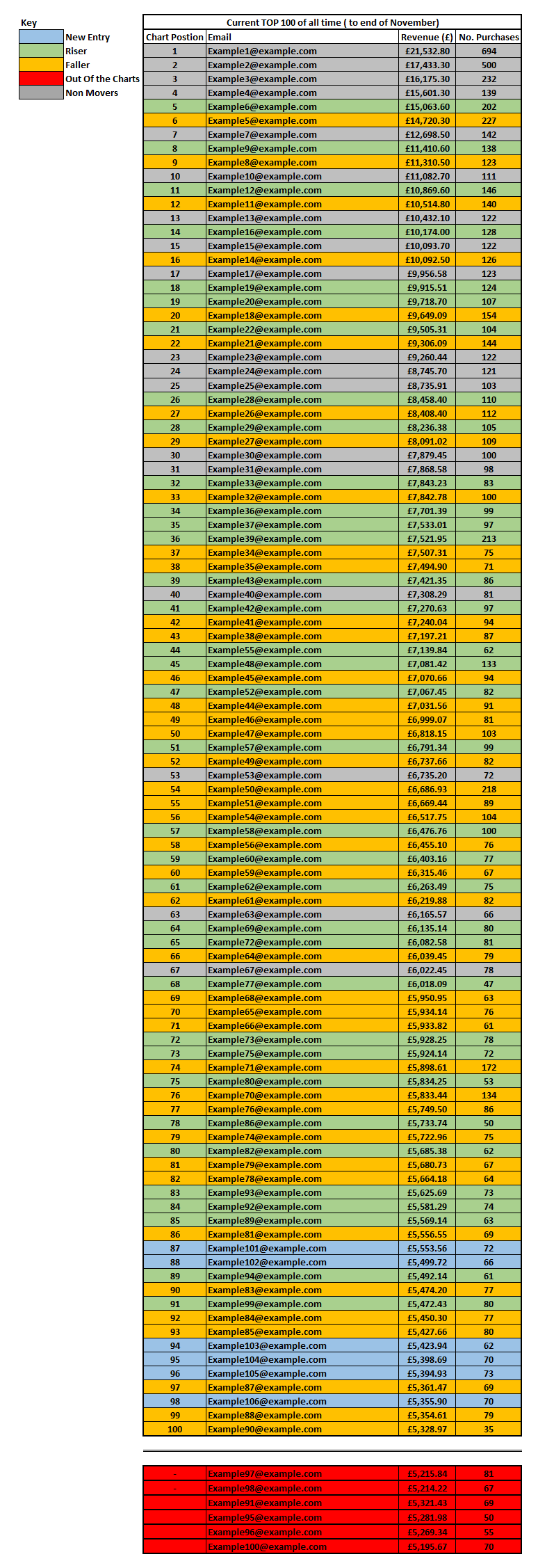
Top 100 Customers of All Time
To get started we need to first work out the top 100 customers of all time based upon whatever criteria is required, e.g. how much they have spent, how often they open or click etc, all dependent on what information is available, just up to the end of one month before the last full month. For example, given this month is December 2016 we’d start with top customers all the way up to October 2016 and then we can repeat the process all the way up to the end of November 2016 and then voilà, we have two charts to compare.

If you store your charts in a spreadsheet like Excel you can utilise the conditional formatting tool which means the colours to reflect the various changing positions (or there lack of) will automatically update if you overwrite the chart allowing you to create a template (but this will take some external processing with something like SQL to compare the old chart to the new to determine whether that email has risen or fallen since the previous month):
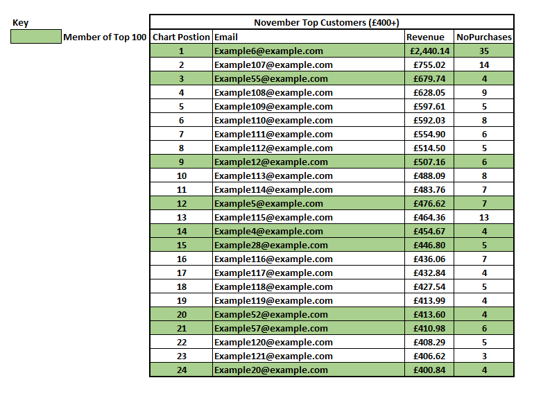
Monthly Top Customers
You can also pull your top customers just for the previous month (November 2016 in this case) and flag any that are also top customers of all time to really highlight your active best customers:
So now we can easily see who are the risers (green), who are the fallers (yellow in an amber sort of way), who are falling out of the top 100 (alarming red), and who are some newcomers that seem to be on a roll (blue) and if you repeat this process every month you can track their journeys even further. Now you can be a bit smarter about how you target the significant people, whether it be a thank you or an enticement to come back, to strengthen your relationship with them and continue to nurture their brand loyalty.