People like stats. People like numbers.
How many points have you earned? What was your total number of steps walked last week? Was your screentime up or down? Personalised, bite-sized snippets of information are well-suited to the transient nature of email. Rambling walls of text (like this article) are not.
But you know what’s even better than straight-up figures? Those figures… in graphical form. A picture is more engaging, more instinctively understandable. That picture might be a bar graph or a pie chart or any other visualisation that meets your need. If you can think it, there’s probably a way to do it.
Let’s take the theme of loyalty points. If your customer can see their progress – rather than simply read it – perhaps that will give them the push to go a little further and earn those rewards.
How does one go about turning data into email charts? It turns out you’re spoiled for choice.
Call in the experts
There are specialist agencies that recognise the power of visual information. Movable Ink, Fresh Relevance, Liveclicker and Kickdynamic to name a few. Quoting Movable Ink: “Visual is the language that moves people.” That’s a succinct motivator as to why we’re doing this.
By integrating third party platforms with your data, one-to-one images can be generated on the fly. The image is called via the customer’s copy of the email and typically passes in their email address as a parameter. Your customer will always see the most up-to-date information regardless of how much time has passed between send and open (or re-open for that matter). And because this image creation is handled remotely, there are no compatibility concerns. This content works across the board.
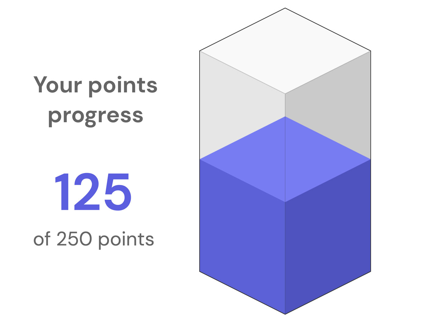
What you do with this power is up to you. The creative scope is vast. My inventiveness stretched as far as a bar graph. But at least it’s in 3D!

Now you’re speaking our language
Fancy a somewhat more DIY approach? Email marketing platforms often come equipped with a built-in language that is accessible to end users. You can use it to set up logical rules. If this, do that.
Imagine that your customers’ loyalty points are fed into your email platform. That gives you a number to utilise. If the number is high, you might want to add a message like “nearly there!”. If the number is low, you could add a reminder about the benefits of your rewards scheme.
Or you could convert those numbers into dimensions and thus render a chart. Here’s one I made earlier.

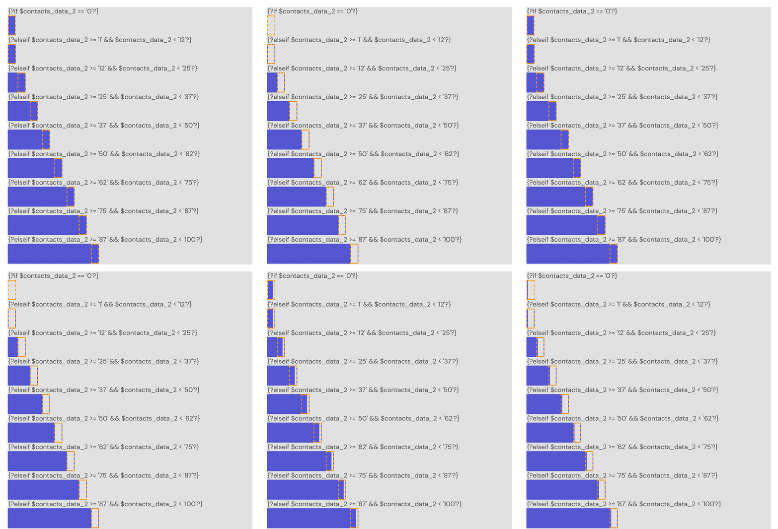
That’s comprised of a pair of nested tables with different background colours. There’s a multi-part IF statement that checks how many points the customer has and then sets the width of the blue bar accordingly. An animated GIF sits at the end of the bar to bring it to life and imply change. I have 90 points today, maybe that will be 190 next week. Here’s a behind-the-scenes look at the setup.

Stick to the script
You are probably familiar with email countdown timers. They show a clock ticking down towards zero and are regularly featured in sale-ends-soon emails. Better buy something while you can!
These timers are powered by PHP. A hosted script is called when the customer opens your email. The current time is compared to the specified sale end, and an animated countdown GIF is generated and slotted into the email. This process takes milliseconds.
To be clear, you are not embedding a script in an email. That’s not possible. Instead you are referring your email to a pre-hosted script via an image reference.
That inspires a question: why restrict this technique to countdown timers alone? There’s nothing to stop us using PHP to output other kinds of images. What’s more, the script can be fed parameters that result in content tailored to the customer. First name personalisation has never looked so good!

Does this qualify as a personal touch?
But let’s stick to the chart theme. We’ve done a 3D bar and a 2D bar. How about pie?
PHP can draw shapes. One of those shapes is a filled arc. We can send customer points to the script and via some simple maths it’ll be converted to degrees of rotation. Add a little bit of trickery to achieve a 3D effect, output the image and it’s job done.

And here’s the real beauty of dynamic PHP-generated images – all that needs to go into the email is a simple image reference. Something along these lines:
<img src="https://img.whatever-your-domain-is-called.com/pieChartGenerator.php?points={?customer_points?}">
Word of warning: if you’re sending to a large mailing list, make sure your script exists on a server that can handle the traffic!
Data with destiny
This option blurs data-processing with content, and is therefore sequentially odd. But it is an option and it works and it may even be the right one for your particular setup and data flow.
SQL is the language of data. If you have SQL processes importing data to your email platform, then you can do things with that data. You could for instance assign different pieces of content based on a customer’s stats. That content might be an image, or some text, or a different link. Pretty much anything you like in fact.
Creating multiple extra fields for items such as image references and snippets of copy is impractical. What is practical is working with a single field and populating it with JSON data. This syntax allows for multiple items of information to be grouped at the SQL stage and later separated into usable content in the email.
This all sounds a bit dry so far, so I’ll demonstrate it with a mock-up. After all, this article is about turning information into illustration.

Let’s examine how such a piece of content might be constructed. Customers have loyalty points on file. In our SQL script, we check what range those points fall into. The relevant image is then picked from a bank of animated GIFs. There’s a different GIF for each of those blue segments.
The 224 points is pulled directly from the original field. The accompanying “Nearly there!” on the other hand was selected at random from a list of encouraging phrases appropriate to points status. Maybe next time it’ll say “So close!” or “Just a few more to go!”. A touch of randomisation could provide some welcome variety in your emails.
And finally, the button link points to different page depending on the customer’s membership tier. Casual shoppers could go to one page, big spenders to another.
SQL is a powerful tool for segmenting mailing lists, but with a bit of forward-planning it can double up as an effective dynamic content system.
CSS-powered email charts
Objectively this may not be the ‘best’ option but it’s hands down my favourite. Modern CSS is an incredibly versatile technology, lending itself to fluid animation and effects. With some experimentation, some calculation and bit of trial-and-error you can truly push the boundaries of email design.
Unfortunately, not every email service believes in CSS magic. For the non-iPhone Mail, non-Apple Mail and non-Samsung people of the world, you’ll need to provide some fallback content. That could and should be one of the other, widely-supported methods above.
Here’s my example of turning data into images via CSS.

This is a GIF-format screen recording. Trust me when I say that the real thing is silky smooth.
Let’s take a look at how that works:
-
- There’s a disc shape, coloured 50% blue and 50% grey using a CSS gradient.
- There are a couple of all-white shape masks to create the illusion of an arc.
- A CSS keyframe animation rotates the arc according to the number of points earned.

But how are points turned into degrees? That’s where CSS’s calc(ulation) function comes in.
transform: rotate(calc((200 / 250) * 180deg
The customer has earned 200 of 250 points. 200 divided by 250 is 0.8. The arc spans 180 visible degrees, so that’s our range of motion. 180 multiplied by 0.8 is 144. And that’s how many degrees the arc will turn for that particular customer. Points of course would be fed in dynamically from your customers’ records, thus giving everyone their own pixel-perfect variation.
This project required a mere 3KB of code and no external image files – it’s all neatly self-contained. Factor in fallback content and we’ll call that another 3KB (and that’s being generous). So that’s six kilobytes all in. That’s a very acceptable portion of an email’s 100Kb code limit.
Ready to email charts a go?
Email marketing is all about communicating information quickly and clearly. Purposeful imagery helps achieve that.
A loyalty points bar is a nice start. But imagine taking this concept to the next level. Combine multiple blocks and you could be sending your customers fully personalised infographics.
And all this for a negligible impact on file size. Even CSS, the most code-heavy option, barely makes a dent. There’s nothing to lose and everything to gain.


