

One of the best ways to see how your data is performing is to analyse trends. You may have, for example, a nice, easy to interpret worm wiggling its way upwards on a line graph which obviously shows your metric is increasing over time. However, some forms of data cannot necessarily be displayed in such a flat format, and may be better viewed dynamically. For example, say you were looking at which email devices and browsers were being used to actually open your emails. The best way to show it is probably in a pie chart to see which devices have the biggest shares, but if you wanted to look, say, month by month to see if any device was increasing or decreasing its share (which may affect your email strategy) then side by side is probably not all that helpful. MS Excel is one example of software that can actually be used to create such a dynamic comparison, but it does involve a bit of fiddling with pivot tables, VLOOKUPs and array formulas.
Setting Up
So, looking at the top 10 devices in a month imagine you had data since November 2013. The first step is to create a list which you can turn into a menu with a sequential index for each month. It may look odd to have the same index on either side of the month, but these indexes are used for two different processes which require matching the first column of an array, so for one instance the matching element is the month and the index is returned and for the other the month needs to be returned so the index is matched:
| Month | ||
| 1 | Nov-13 | 1 |
| 2 | Dec-13 | 2 |
| 3 | Jan-14 | 3 |
| 4 | Feb-14 | 4 |
| 5 | Mar-14 | 5 |
| 6 | Apr-14 | 6 |
| 7 | May-14 | 7 |
| 8 | Jun-14 | 8 |
| 9 | Jul-14 | 9 |
| 10 | Aug-14 | 10 |
| 11 | Sep-14 | 11 |
| 12 | Oct-14 | 12 |
| 13 | Nov-14 | 13 |
| 14 | Dec-14 | 14 |
| 15 | Jan-15 | 15 |
| 16 | Feb-15 | 16 |
| 17 | Mar-15 | 17 |
| 18 | Apr-15 | 18 |
| 19 | May-15 | 19 |
| 20 | Jun-15 | 20 |
| 21 | Jul-15 | 21 |
| 22 | Aug-15 | 22 |
| 23 | Sep-15 | 23 |
| 24 | Oct-15 | 24 |
| 25 | Nov-15 | 25 |
| 26 | Dec-15 | 26 |
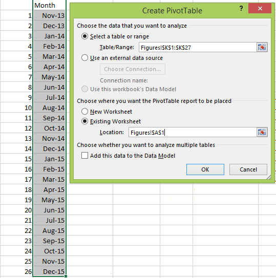
This can then be turned into a pivot table. Select the whole month data, click Insert / PivotTable and choose where you want it to appear in your worksheet:
You should then only have the Month as a field option which you should click, ensuring it is only in the ROWS section:
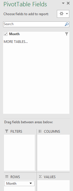
Then, under PivotTable Tools / Analyze you can insert a slicer which will act as your selection list:
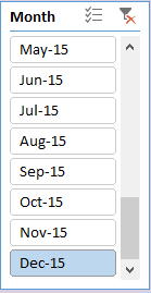
In order to determine which month a user has clicked on the pivot table should display whichever month is highlighted in Cell A2 and we want to turn this into its matching index from the month list. To do this select another cell in your worksheet and enter the formula:
=VLOOKUP(A2,K2:L27,2,FALSE)
where A2 is the pivot table output; K2:L27 covers the month labels and their right side index; 2 refers to which of the columns (1: month label, 2: index) to return and FALSE refers to an exact match.
Selecting Monthly Data
Next you will have to display your email device data in a usable and searchable format. The best way is to have each month listed one after the other, but with an index and month label so each section can be isolated:
| 1 | Oct-15 | Safari mobile | 550,898 | 42.90% | |
| 2 | Oct-15 | Gmail | 132,923 | 10.40% | |
| 3 | Oct-15 | Chrome Mobile | 115,441 | 9% | |
| 4 | Oct-15 | Apple Mail | 101,171 | 7.90% | |
| 5 | Oct-15 | IE | 75,181 | 5.90% | |
| 6 | Oct-15 | Chrome | 66,764 | 5.20% | |
| 7 | Oct-15 | Windows Live Mail | 36,729 | 2.90% | |
| 8 | Oct-15 | Android browser | 35,366 | 2.80% | |
| 9 | Oct-15 | Outlook 2010 | 30,329 | 2.40% | |
| 10 | Oct-15 | Firefox | 28,352 | 2.20% | |
| 1 | Nov-15 | Safari mobile | 938,568 | 44.80% | |
| 2 | Nov-15 | Gmail | 217,005 | 10.40% | |
| 3 | Nov-15 | Chrome Mobile | 203,215 | 9.70% | |
| 4 | Nov-15 | Apple Mail | 149,858 | 7.10% | |
| 5 | Nov-15 | IE | 116,052 | 5.50% | |
| 6 | Nov-15 | Chrome | 108,209 | 5.20% | |
| 7 | Nov-15 | Windows Live Mail | 55,239 | 2.60% | |
| 8 | Nov-15 | Android browser | 46,416 | 2.20% | |
| 9 | Nov-15 | Firefox | 45,612 | 2.20% | |
| 10 | Nov-15 | Outlook 2010 | 45,024 | 2.10% | |
| 1 | Dec-15 | Safari mobile | 1,361,320 | 45.40% | |
| 2 | Dec-15 | Chrome Mobile | 314,742 | 10.50% | |
| 3 | Dec-15 | Gmail | 308,065 | 10.30% | |
| 4 | Dec-15 | Apple Mail | 207,934 | 6.90% | |
| 5 | Dec-15 | IE | 156,295 | 5.20% | |
| 6 | Dec-15 | Chrome | 147,863 | 4.90% | |
| 7 | Dec-15 | Windows Live Mail | 74,385 | 2.50% | |
| 8 | Dec-15 | Android browser | 65,706 | 2.20% | |
| 9 | Dec-15 | Firefox | 62,024 | 2.10% | |
| 10 | Dec-15 | Outlook 2010 | 59,484 | 2% |
So each device or browser is assigned an index 1-10 and its month label. The reason for this is so a “current month” section can be updated by matching back to the month and then the index which will pull in just the records matching on both.
To create your “current month” you can start it by having the numbers 1 to 10 in a chosen vacant column which will be the rows where the 10 devices will appear for any chosen month. The next column will contain the month to match back, and this needs to be determined dynamically. So next to your first index you can enter the following formula and copy it down to your last index:
=VLOOKUP($M$2,$J$2:$K$27,2,FALSE)
The dollar signs ensure that when you copy the formula the cell references won’t get altered. M2 refers to the index number of the month returned by whatever was selected on the slicer by the user. J2:K27 is the month array selection choosing the left index and month labels, with 2 telling it to return the month label and once again FALSE ensuring an exact match. So now when you adjust the slicer selection, this column should change to reflect it. This means we are now in a position to pull in the records from our raw data. This is where the array formula comes in. To the columns right of the month label you can now enter in the following formulas in each ensuing column:
=INDEX($B$2:$G$261,MATCH($M10&$N10,$B$2:$B$27&$C$2:$C$27,0),4)
=INDEX($B$2:$G$261,MATCH($M10&$N10,$B$2:$B$27&$C$2:$C$27,0),6)
So B2:G261 covers the whole of the raw data to be searched on, M10&N10 takes the current index (always 1-10 as this is static) and month label that has been generated from the slicer and matches the pair to the index and month label found in columns B and C of the raw data. The final number (4 and 6) refers to the column number of the selected array (from B to G means there are 6 columns) to return the data of.
To turn these into an array formula, once they are pasted in if you press Ctrl + Shift + Enter they will change to having curly brackets either side then you can copy them for the rest of the rows and you should see the matching data dynamically appear in these cells from the raw data.
All that’s left to do is create a pie chart of this selected area which will dynamically update once the slicer selection is changed and you can see a much more comparable change as you move from one month to the next which is much easier to interpret than if the graphs were side by side.
Download a working example here.
One thing you may notice is that Chrome Mobile has gradually been working its way up into second place so spotting something like this could have an impact on how you design your emails knowing more people are going to view it in this way. It may be a bit fiddly at first, but once you get your head around how to create such graphs dynamically you can improve your analysis and understanding of your data.