It’s no secret that people these days are having email marketing thrown at them from all over the place. It’s also no secret that email marketing does work. But it can always work better. With so much consumer email being sent it’s very important to stand out from the crowd. In this post, I’ll go through some of the techniques you can use to do just that, with some examples of companies already doing it.
Be bold, be adventerous
Emails generally fall into very predictable and re-usable patterns, which isn’t a bad thing at all. In fact, in terms of maximising email profitability it’s very good. But just because an email design falls into a tabular based design doesn’t mean it can’t be adventurous and stand out from the crowd. This recent email from Apple, which was pointed out to me on Twitter by Mark Robbins, follows a very common design pattern of a large hero section, followed by a two column section. However, they’ve used a contrasting colour palette, increased line-spacing, emotive background imagery and beautiful fonts to make it look amazing. It definitely stands out compared to a regular product launch email.
Really sell your product
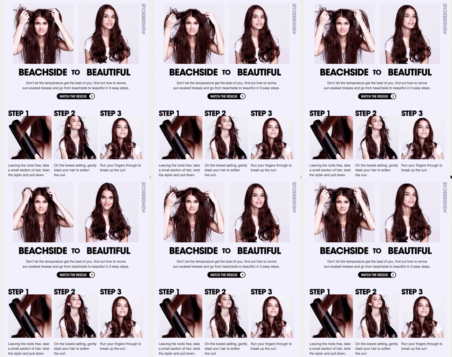
A lot of emails that land in my inbox are simply a grid of products with a price and a call-to-action. A recent email I received from GHD goes above and beyond this. First off, it has a fantastic animated GIF demonstrating the before and after of using their product.
After that, it has a step-by-step guide on using their product, all from within one email. Very clever! And again, it stands out from the usual email in your inbox.
Animation is your friend
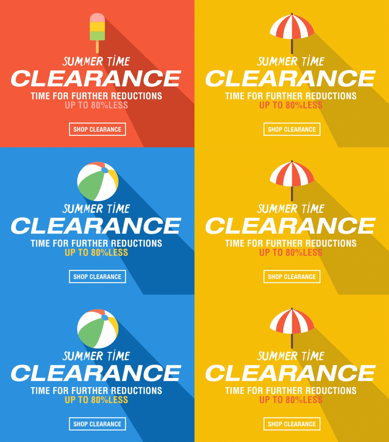
Animation can be used in a lot of different ways in email but I really enjoy the way TK Maxx, a British retailer, used this combination of bold colours and animation to draw attention in their email.
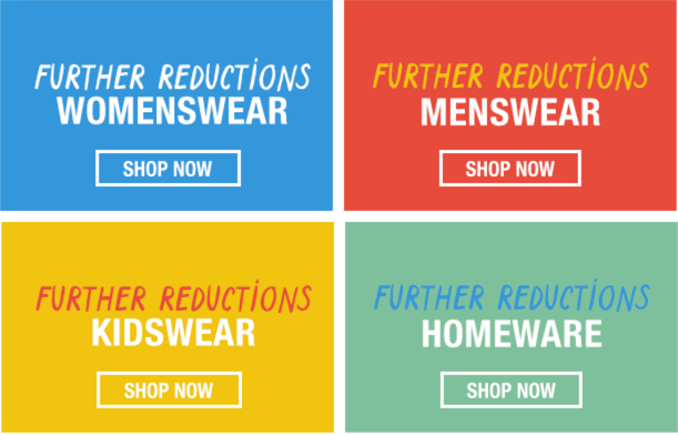
It’s especially nice because as you go further down the email, they continue the design style and the bold colour options:
Create a sense of urgency
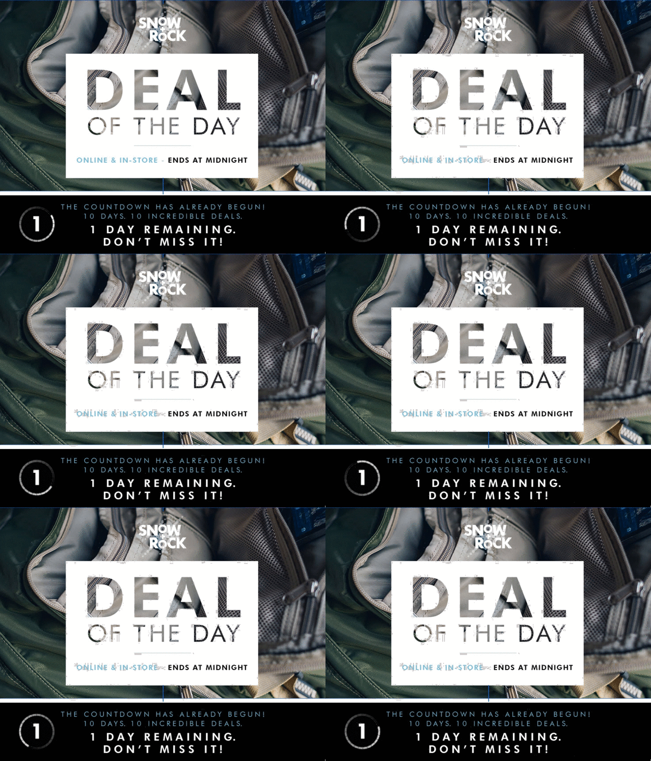
Creating timely content and then encouraging people to act on the time factor of it is no small task, but I think Snow+Rock do this perfectly in their latest series of emails. They offer ‘Deals of the Day’ – deals that last only until midnight that night and include a neat little spinning animations to encourage people to purchase:
Reebok also recently did something similar, sticking a nice flashing animated banner at the top of their email that simply said “Last Chance”, again, creating that sense of urgency inspiring customers to purchase
Keep your content relevant
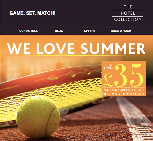
No-one wants to be receiving Christmas emails in July. This may sound like common sense, but a lot of companies have an email calendar of promotions that they stick to fairly rigidly. One of the largest sporting events of the year was Wimbledon, and The Hotel Collection latched onto the mood perfectly with this beautiful and well-timed hero image in their email.
Inspire your readers
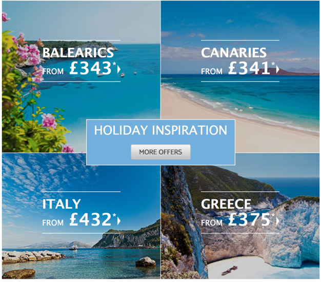
This tip is especially important if your sending from a travel based company. Your subscribers may not be looking at that time for a holiday. It’s your job to inspire them to buy one anyway. I absolutely love receiving travel emails, and I love this grid of destinations mixed with beautiful imagery from Thomson.
It really inspires you to just pack it all up and book a holiday, don’t you think?
Summary
There’s lots of different things you can do stand out in the email crowd, a lot I haven’t even covered in this post. I’d love to hear what you think of the examples I’ve included in this post. Or if you have any other examples of people standing out in the inbox, please do share them in the comments!


