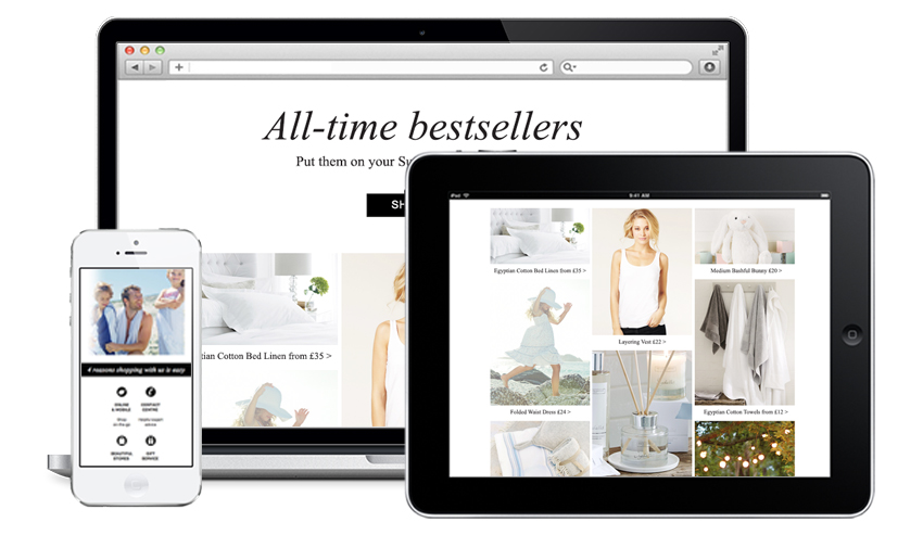
In 2011 it was clear smartphone adoption had reached a tipping point. People were already looking at emails on their devices and that number was only going to grow.
Discussions began about working with The White Company to turn, what were mostly, emails that were one big image, in to emails which adapted to any device and were designed to engage customers and increase traffic. In 2012 their new mobile website was launched and a full analysis was conducted on response levels for existing emails, including open and click rates and revenue generated. This was then plotted against device open rates over time to identify trends.
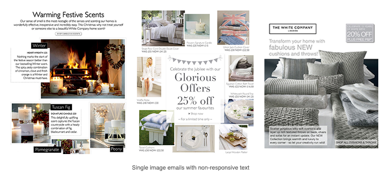
All stakeholders were involved, from senior management to the in-house email, design, branding and e-commerce teams and a plan to create a phased approach to move towards fully responsive emails put in place.
The challenge was to keep within strict brand guidelines whilst ensuring customers had the best user experience with emails. All of us had to rethink layout, navigation, calls to action, use of imagery, copy, link placement, font types and size and how all these elements would appear across a range of devices and screen sizes. We also had the usual challenge of short lead times and product and pricing changes at the last moment which is not uncommon in the retail sector.
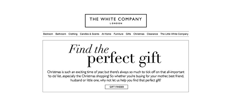
The first steps were to pull elements from the single image and build a wireframe to accommodate a series of headers and footers for each customer type. A range of templates were built using a modular building block approach to create a flexible and faster way of working.
Text on images was part of the style used across all marketing channels so was initially kept for email but modified to ensure copy was still legible on small screens. Using close font matches, areas within each email were changed to text which adapts to each device by wrapping and increasing in size when viewed on smaller screens.

The number of items in the navigation bar at the top of every email was reduced but initially kept as an image due to a stylised font. Text links were changed to white copy on black buttons to improve prominence and encourage tapping.
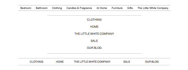
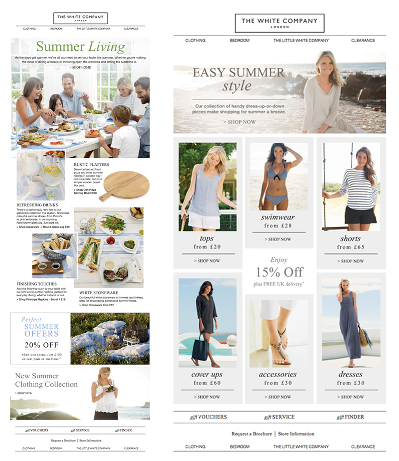
The next stage was to remove all text on images where possible and to crop certain images to ensure products were clearly visible. Where copy was still required on images, clever use of background colour matching was used to retain the effect on larger screens whilst stacking copy above or below images on smaller screens.
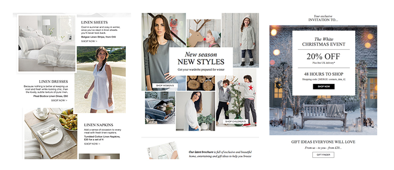
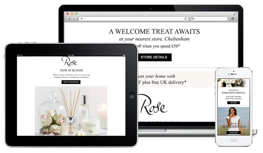
The final transition to fully responsive email design began. The navigation strip was turned from images into live text and coded to stack on a small screen. Layouts were reordered to create a single column of images, text and easy to tap buttons. Full width images were resized. Where emails displayed a high number of images, some were hidden on mobile devices to reduce the need for scrolling and overwhelm people with too many choices.
Due to the short lead times to build emails using responsive code and creating multiple options for dynamically generated content based on user data, a library if scripts was created to shorten the time from brief to delivery. Our design, coding and data teams worked closely to streamline every possible process to ensure campaigns were sent on time.
Throughout the entire project, results were carefully monitored. Bespoke weekly reports were compiled and analysed and quarterly reviews were conducted. Best and worst performing campaigns were tracked, evaluated and fine-tuned for improvements where there was scope to do so. Email opens and clicks increased and opens by device now account for over two thirds of total opens, up from a fifth at the start – a huge rise and one which is higher than the industry average.
In the Autumn of 2013, The White Company launched in the USA and the emails were quickly up and running as the template designs required little modification over the UK versions. New benchmarks were set for response levels and email delivery monitored across a range of new domains.
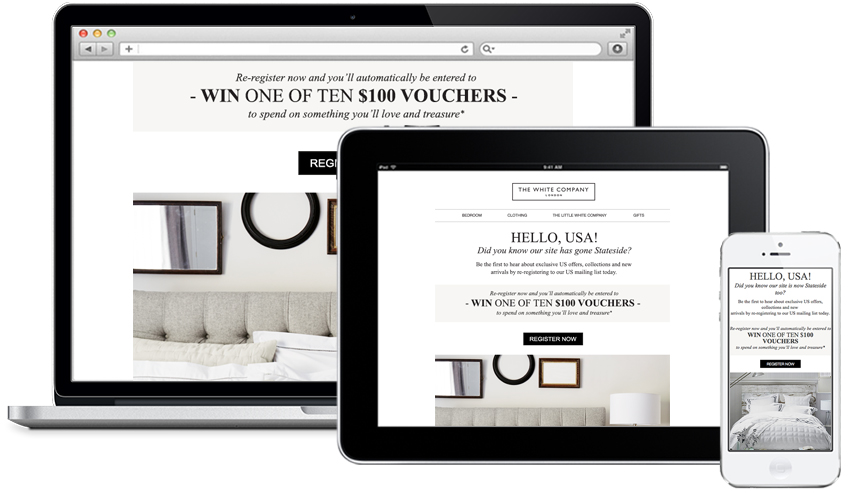
Another recommendation was to give new subscribers a better experience. A welcome programme was implemented using a sequence of five emails spread over a 10 day period. The sequence adapted according to user interaction, so people making a purchase would be pulled from the programme and added to the master list with relevant attributes to enable targeting for future campaigns. The process is designed to introduce new subscribers to The White Company, set expectations of what emails they would receive and to encourage them to make a purchase at an early stage.
As email volumes and the number of campaigns increased during the all important quarter in the lead up to Christmas, careful attention was paid to any shifts in delivery and response rates. A web-based preference centre was introduced, linking through from the email unsubscribe, presenting people with a range of options to select certain emails, resulting in a six per cent reduction in unsubscribe rates.
Revenues and the number of orders continued to rise and were further enhanced with more granular segmentation to enhance targeting, including top customers receiving offers in advance of the rest of the list, and the introduction of new emails thanking first time purchasers with an incentive to buy again.
The results – from user engagement through to revenues – show that the move to fully responsive emails, combined with constant monitoring, reporting and reviews show a big improvement in the effectiveness of the email channel.
